Hi, I'm a young designer student looking for a career in box cover design. Please like and comment. Thanks a lot.
 Breaking Bad Box Cover Comments
Comment on Mainline Design's Breaking Bad Box Art / Cover.
Hi, I'm a young designer student looking for a career in box cover design. Please like and comment. Thanks a lot.
Comment on Mainline Design's Breaking Bad Box Art / Cover.
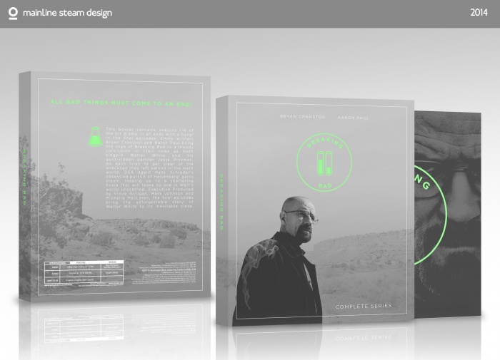
Very nice and professional. Its sleek and clean, plus I love the logo on the front. My only request is that you use a slightly darker shade of green for the logo and tagline. I had to squint a bit in order to see it. Ultimately, this is fantastic, one of the best Breaking Bad boxes Ive seen.
[ Reply ]
I really like the design itself, however I don't think it quite fits the breaking bad theme. You have that splash of green in there, which is a nice pop of colour, but something a bit darker than that seems more suitable for the series.
I noticed also, like your previous design, they are very similiar when it comes to style. I like this kind of style myself, but at the same time it's good to have diversity and create something outside of your comfort zone. I have no complaints when it comes to the leading and image choices (however, I wish you had bought some of that darker gray somewhere to the back, just as a hint for contrast because everything gets a little lost in the same saturation), just the overall style doesn't seem that suitable. It might sit better if instead of that gray being the solid colour, you chose a darker green and turned the light green into white or some other lighter colour.
[ Reply ]
I like it, but I agree with luci
[ Reply ]
I agree with the above two, it's lovely! But the green could be a tad darker. It works for the slide-out case because the background is darker but for the front and back a darker tone might be better. :)
[ Reply ]