OK, it shouldn't be a touch-gerenations game, for starters, next, your blending and back font leave a lot to be desired, as does your spine. Your Nintendo logo is too big, your "E" too small. I like the character grouping on the front though :)
1. Eeeeewwww... the background looks like an emo kid puked. This is just most likely due to my hatred of emo.
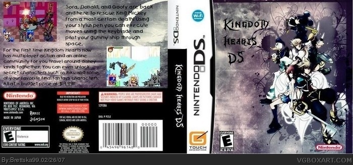
2. How on Earth could it possibly be Touch Generations?
3. Is that an ESRB logo? *gets microscope* Yep. If only it was visible to the human eye
4. Why is your name on it? Where's the Square-Enix logo?
5. What's with the Chain of Memories screenshots?
6. There are a few grammatical errors on the back.
It's okay. Probably your best. I kinda liked "Noob: The Game", though. You get a 3/5. Fix it and you might get a 4.
I don't know what these other people are talking about. I really like the look of this! The color scheme works really well, and I think the back font, while it could be clearer, is cool too. And I like the idea that this game could be a Wi-fi game. Overall 4.5/5
 Kingdom Hearts DS Box Cover Comments
well here it is my Kingdom Hearts DS box
[ Reply ]
OK, it shouldn't be a touch-gerenations game, for starters, next, your blending and back font leave a lot to be desired, as does your spine. Your Nintendo logo is too big, your "E" too small. I like the character grouping on the front though :)
[ Reply ]
A few problems.
1. Eeeeewwww... the background looks like an emo kid puked. This is just most likely due to my hatred of emo.
2. How on Earth could it possibly be Touch Generations?
3. Is that an ESRB logo? *gets microscope* Yep. If only it was visible to the human eye
4. Why is your name on it? Where's the Square-Enix logo?
5. What's with the Chain of Memories screenshots?
6. There are a few grammatical errors on the back.
It's okay. Probably your best. I kinda liked "Noob: The Game", though. You get a 3/5. Fix it and you might get a 4.
[ Reply ]
#3, he must have used CoM screens because GBA is one of the closest things to DS. i wouldv'e if i made this. (a better version anyway)
kingdom hearts ds... more like emo hearts ds
[ Reply ]
#3, 3 is being generous.
[ Reply ]
I actually think it's quite nice, but the font on the back is a bit sloppy so you get a 3.5/5 from me.
[ Reply ]
ok i took of touch generations logo but if you can make this 3-D pm me and i will be sure to give you credit!!!! :)
[ Reply ]
#7, i deleted it i'll fix it up more
[ Reply ]
I don't know what these other people are talking about. I really like the look of this! The color scheme works really well, and I think the back font, while it could be clearer, is cool too. And I like the idea that this game could be a Wi-fi game. Overall 4.5/5
[ Reply ]
clap clap clap!!! im sooo favouriting this! 1000000/5! y r people saying its bad? its soooo good!
[ Reply ]
how do you make boxarts with two sides this is great boxart you made
[ Reply ]
MUST HAVE GAME!!!!!!!!!!!!!!!!!!
[ Reply ]