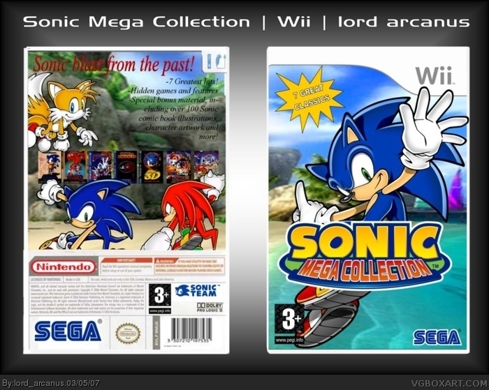
Well Arcanus this is cool. I really like the front the only thing I would suggest is a different font on the "7 Great Classic". The font is great but I'm not crazy about the back. I like the idea with having each game cover but you should have each one with its own area. If you don't want to do that than at least change the font so its easier to see. The front is great but the back pulls the rating down to a 4/5. Change the back and I'll change my vote.
 Sonic Mega Collection Box Cover Comments
credit to crayon man for template.
i promise i won't be making any more sonic boxes for a while.
looks better in full zoom.
[ Reply ]
I like it. 4.5/5
[ Reply ]
the back template looks crappy because i made it myself, modifying crayon man's original template.
[ Reply ]
nice
[ Reply ]
why did you make it skinny? maybe you should put a white outline on the text on the back.
[ Reply ]
doesn't looks too skinny to me.
[ Reply ]
Well Arcanus this is cool. I really like the front the only thing I would suggest is a different font on the "7 Great Classic". The font is great but I'm not crazy about the back. I like the idea with having each game cover but you should have each one with its own area. If you don't want to do that than at least change the font so its easier to see. The front is great but the back pulls the rating down to a 4/5. Change the back and I'll change my vote.
[ Reply ]
Good box, but not so much the back 4.5/5.
[ Reply ]
nice effort. the font on the back is fucking awful. The "7 Great Classics" is unbelievably awful. Other then that it is rather good.
[ Reply ]
I don't care for the text on the back, but overall a nice job. 4.5/5
[ Reply ]
3.96, wow this is fucking unbelievable.
[ Reply ]