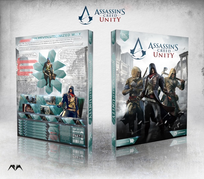
Very cool and well put together! I do have a few nitpicks in the text though,
There are a couple spots of bad english/mispellings (I.E. Wellcome to Paris In Revolutionized Way) which I'm assuming are there because english isn't your first language (which is fine but maybe have another member proof read over your text beforehand to make sure everything looks/sounds right!).
I feel like theres a bit too much text on the back thats all segmented differently to fill up space, wouldn't be a bad idea to have some empty space back there! It looks like some facts are repeated in the back text as well so maybe cut back on having information on their twice and give things a little room to breathe!
Next I'm not sure that "Crossbow Guy" "Axe Guy" etc. are proper names for the characters haha, the pictures don't reflect their weapons very well either so maybe it would be better to list and show the weapons down there?
And finally the text box on the right isn't formatted too well with the text wrapping inside the box and looks like it could be played around with a bit more.
Definitely a solid box and design but the amount of text on the back could probably be brought down a little and have its errors fixed!
too many problems! are you sure?
Actually I have nothing to say...
BUT
#1. "Welcome to Paris" & "In Revolutionized Way" both are separate. (look carefully)
#2. If you look a little more, you can get that texts are necessary! (as you said "wouldn't be a bad idea to have some empty space back there")-(I know...!)
#3. The box are generally a special theme and I tried keep it to during the design.
#4. They are not characters names. Actually i know...and you know. as you said, it would be better if i use weapons pictures, but I didn't have a picture of them. (sorry!)
#5. To answer this problem, you can read #3 or #2.
 Assassin's Creed: Unity Box Cover Comments
link
[ Reply ]
Nice work Amir
[ Reply ]
The shapes and the textures you created are lovely. Like the colour palette a lot too. Great job.
[ Reply ]
awesome / fantastic
[ Reply ]
Very cool and well put together! I do have a few nitpicks in the text though,
There are a couple spots of bad english/mispellings (I.E. Wellcome to Paris In Revolutionized Way) which I'm assuming are there because english isn't your first language (which is fine but maybe have another member proof read over your text beforehand to make sure everything looks/sounds right!).
I feel like theres a bit too much text on the back thats all segmented differently to fill up space, wouldn't be a bad idea to have some empty space back there! It looks like some facts are repeated in the back text as well so maybe cut back on having information on their twice and give things a little room to breathe!
Next I'm not sure that "Crossbow Guy" "Axe Guy" etc. are proper names for the characters haha, the pictures don't reflect their weapons very well either so maybe it would be better to list and show the weapons down there?
And finally the text box on the right isn't formatted too well with the text wrapping inside the box and looks like it could be played around with a bit more.
Definitely a solid box and design but the amount of text on the back could probably be brought down a little and have its errors fixed!
[ Reply ]
too many problems! are you sure?
Actually I have nothing to say...
BUT
#1. "Welcome to Paris" & "In Revolutionized Way" both are separate. (look carefully)
#2. If you look a little more, you can get that texts are necessary! (as you said "wouldn't be a bad idea to have some empty space back there")-(I know...!)
#3. The box are generally a special theme and I tried keep it to during the design.
#4. They are not characters names. Actually i know...and you know. as you said, it would be better if i use weapons pictures, but I didn't have a picture of them. (sorry!)
#5. To answer this problem, you can read #3 or #2.
Thanks for your opinion. :)
[ Reply ]
this is disign very very nice amir jaan
[ Reply ]
Congratulations man
this is my fave assassin's creed unity cover
[ Reply ]