[ Box updated on October 16th, 2014 ] [ original ]
 THE DARK PHANTOM ( IRANIAN GAME) Box Cover Comments
Comment on aradfilm100's THE DARK PHANTOM ( IRANIAN GAME) Box Art / Cover.
[ Box updated on October 16th, 2014 ] [ original ]
Comment on aradfilm100's THE DARK PHANTOM ( IRANIAN GAME) Box Art / Cover.
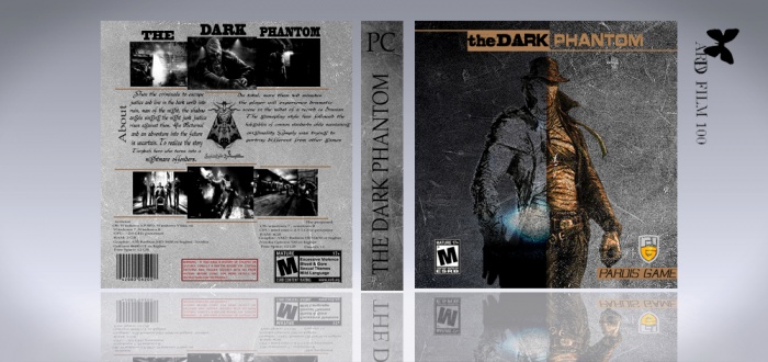
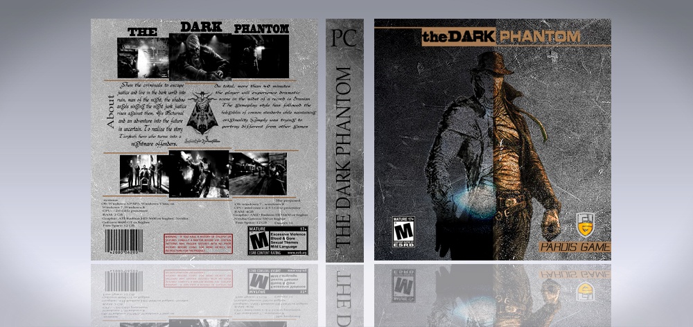
Nice, only thing I can see is on the spine "the dark phantom" is upside down. Other than that good design.
[ Reply ]
ok my friend
[ Reply ]
Wow , Very Interesting Abbas , Welcome Back My Brother ;)
[ Reply ]
thanks my friend
[ Reply ]
we love u <3
[ Reply ]
thanks my friend
[ Reply ]
welcome back my freind
[ Reply ]
thanks my friend
[ Reply ]
Looks Great,Welcome Back . . .
[ Reply ]
thanks my bro
[ Reply ]
This looks nice, you've improved a lot. The only thing I really don't like is the font on the back, which is hard to read. Apart from that, neat.
[ Reply ]
thanks my friend for comment
[ Reply ]
This could be better.
I don't really like the blending of the character with the texture on the front, it just makes it look very grainy and unpleasing to the eye. The idea is interesting, but it doesn't work with the background. Maybe you could have used a night and day background, just a thought.
For the spine, you should have used a PC logo and The Dark Phantom logo, not just text. It looks pretty sloppy.
The organization of the screenshots in the back looks like an interesting idea, but it's poorly implemented since you have text over them. Also, i believe you should use other fonts more fitting to the game.
It isn't horrible, but it could be improved massively.
Also, on the title, you don't need to put that it's an iranian game, you can put that in the description, something among the lines of "This is a box for a game created in my hometown, Iran" or don't put it all.
Sorry if I sound very harsh or negative, it's definitely not the intention i'm going for.
[ Reply ]
My thanks for your constructive criticism
[ Reply ]
Not a big fan of the font on the back, and the spine's text is upside down...
Aside from that I like it
[ Reply ]
wow . so nice
[ Reply ]