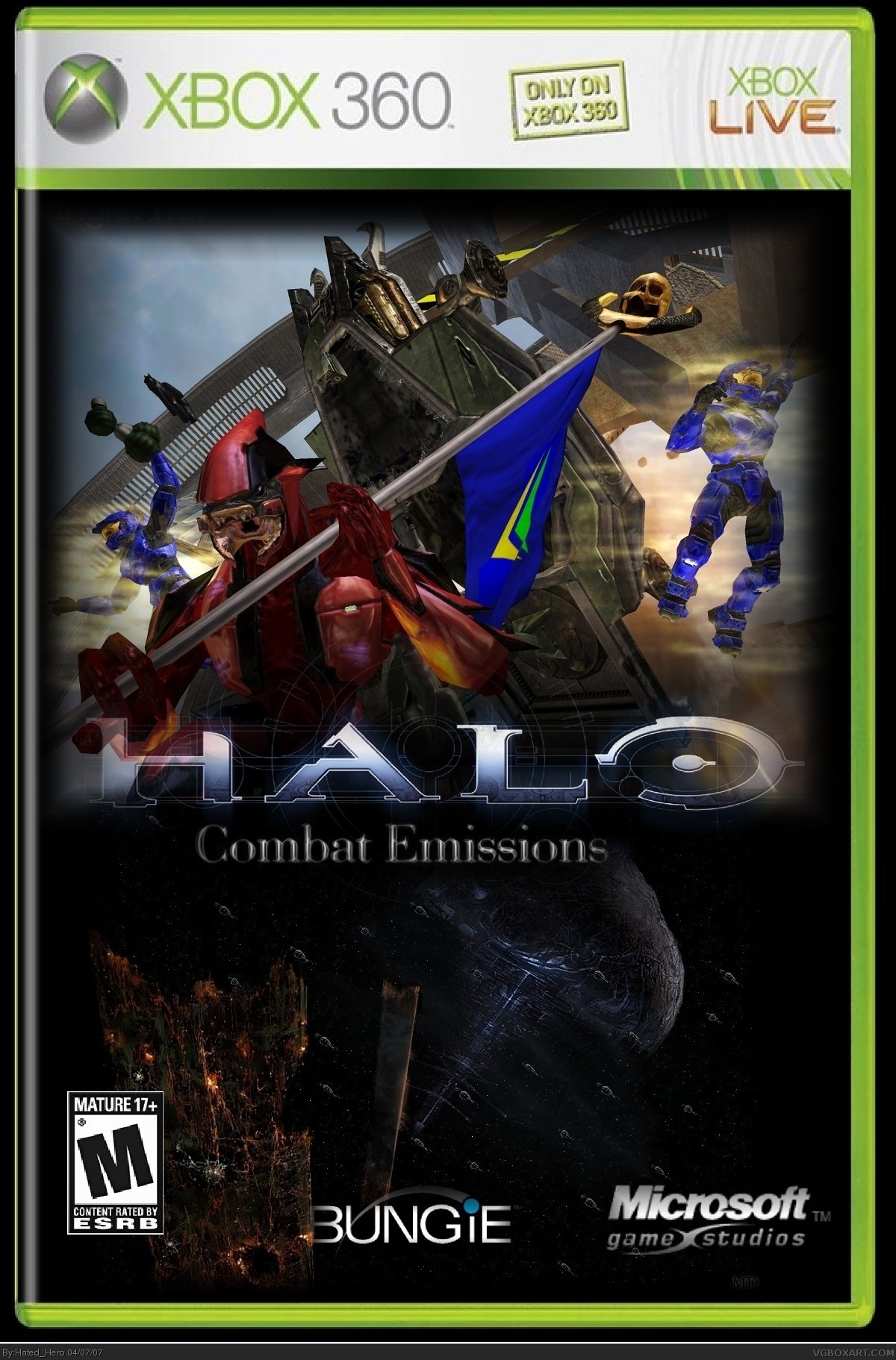
this is okay, i like the fact that its high quality, the logo is decent, blending is okay, the art is a bit weird for a box, the bungie logo is messed up and you forgot the region logo.
but, its not horrible.
i think its pretty good, i just dont like the way you blended it. i think it would be better if the edges on the top pic werent faded on all sides. i think you should just blend the bottom in with the lower pic.
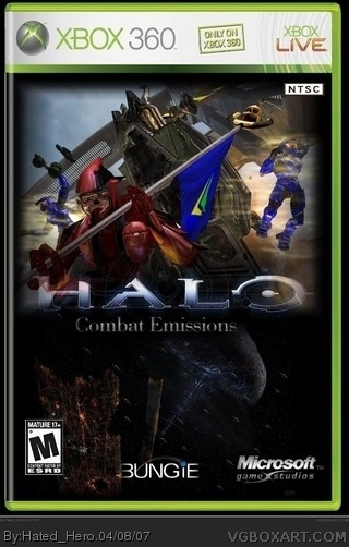
 Halo: Combat Emissions Box Cover Comments
sorry if its not great its a redo of Halo: Portable Emissions I made back when I was MuffinKiller credit to crayon Man for the temp
[ Reply ]
It's actually really cool. But you need to cut out the logos instead of fading them.
[ Reply ]
Yes I agree with Bob nice box but download gimp so you can use cut out logos instead of just fading them
[ Reply ]
Nice. 5/5.
[ Reply ]
You know what Mr. 22 year old. How about sense. This is not, migraine migraine MIGRAINE!!!!!!
[ Reply ]
#4, Id say more like 3.5 to 4 range
[ Reply ]
Sockey, stop trying to change what other people vote. Really good by the way, but it would be good if you cut it without fading it. 4.5/5
[ Reply ]
An emission is like what a fart, or a leaf blower does. It's spitting air out. Combat Missions, maybe?
[ Reply ]
Or what* a leaf blower does.
[ Reply ]
this is okay, i like the fact that its high quality, the logo is decent, blending is okay, the art is a bit weird for a box, the bungie logo is messed up and you forgot the region logo.
but, its not horrible.
[ Reply ]
i think its pretty good, i just dont like the way you blended it. i think it would be better if the edges on the top pic werent faded on all sides. i think you should just blend the bottom in with the lower pic.
[ Reply ]
Combat Emissions-text should be more right but i'll give this a 3.5/5.
[ Reply ]
so would alot of you say im improving ( Im getting Gimp by the way)
[ Reply ]
This has to be one of the most messed-up titles I've ever seen.
[ Reply ]