Hello everyone!
I'm new here to VGBoxArt. This is my first submission. Hope you like it!
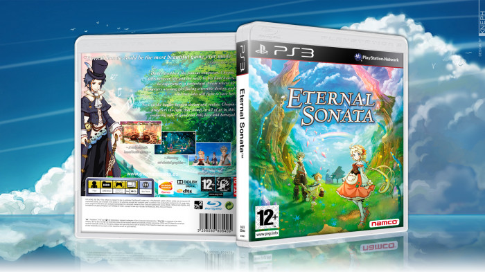
Note: I found the background image online (I only slightly modified it), but I was not able to discover the original author. If anyone recognizes it and knows who created it, please leave a comment so I can properly give credit.
[ Box updated on December 30th, 2014 ] [ original ]
 Eternal Sonata Box Cover Comments
Comment on Kneph's Eternal Sonata Box Art / Cover.
Not bad for your first. The back covers text is a bit hard to read but other than that good job. And welcome to vgba
[ Reply ]
Thanks!
Regarding the text, I opted to make it white based on the reality of a back cover of a box I own (from another game), and it seemed to work well. Nevertheless, thanks for the critique and you do have a point :)
[ Reply ]
@Kneph no problem, viewing in full size it doesn't look that bad. The bandi and dts logos on the back could do with cutting out so they don't have the white box round them.
Please look around at other people's boxes and pm or use the sip forums to get help and feedback. Looking forward to your second box
[ Reply ]
@Vince_1990 I actually added the white around the logos, since that is how they look in the original covers (both XBox and PS3).
I try to always copy the logos, and such, exactly as in the original covers. I do agree that they can interfere with the design sometimes. Guess I'm a perfectionist when it comes to that kind of stuff (standards, templates, logos, etc.). Should learn to let go in the name of design (these are not official covers anyway!).
Again, thanks for the feedback and I'll be sure to check out the forums.
[ Reply ]
Hey, really nice for a first!
The front is majestic, but sadly, the back is not up to par in my opinion.
As Vince mentioned, the text is hard to read. I think having a darker background would've helped. Also, I'm not completely sure on the location of the screenshots, but I don't know any way that could look better.
Still, really nice for a first! Welcome to VGBA, hope you enjoy your stay! :)
[ Reply ]
Thanks a lot!
Yeah, I struggled with the back. Tried a lot of variations and ended with the one that worked best. The issue was the lack of resolution of the images I found and matching the color pallet with the front. That's why I didn't darken the background image.
Anyway, hope I'll do better next time!
Thanks for the feedback and happy to be here! :)
[ Reply ]
@Kneph Something that you could've done was get some inspiration from Pleiades' Eternal box (vgboxart.com/view/47403/eternal-sonata-cover/) as he added that sort of white splash on the back to make the text work.
Also, if you ever need help while you're making a box, be sure to check the Works in Progress forums and we will try to help you in getting better on your boxarts. :)
[ Reply ]
@FrankBedbroken Yeah, I had that box open when I was doing this one and looked at it for inspiration. Just couldn't get the "splash" to work properly.
I definitely should have looked around the WIP forum thread for some help. Not really used to hanging around forums. Since my teenage years I must have posted maybe 5 or 6 times in forums (of any kind). That's almost 30 years on the net without participating in any kind of forums! :P
[ Reply ]
@Kneph Yeah, the only time I have ever participated in a forum was here, on VGBA. But, don't be afraid to post on the forums, even though we like to joke around (a lot), we do try to help people making their stuff.
[ Reply ]
@FrankBedbroken I'll be sure to try to be more participant on the forums. Making stuff alone is not as fun or as productive.
Also, small correction: it's 20 years and not 30 years since I was a teenager :P Ahahah! Made myself over 40 for a moment there.
[ Reply ]
@Kneph Definitely, I've found that without the help that people have given me on the forums, I couldn't have made most of my boxes look decent.
I feel so young compared to you, I'm only 16! :P
[ Reply ]
@FrankBedbroken Hey, I'm 31! It's not like I'm an old man! :D
I started doing box art around 15. Just basic stuff at the time. Didn't have the awesome tools or online information we have available today. Wait a moment... now I do sound like an old dude! Ahahah! :)
Anyway, since that time (when I experimented more), most of the stuff I've done (sporadically), is to reproduce exactly the original boxes. Not for piracy, mind you. Mostly for old games that are no longer printed (PC, Famicom, NES, PS1, etc). So, this is my first "original" box art! :D
[ Reply ]
Wellcome man , agree with Vincent about text , great work bro , cool :)
[ Reply ]
Thanks dude! :)
[ Reply ]
Welcome my friend!
Very nice for a first, I agree with what the others said about the back.
[ Reply ]
Thanks! I also agree with them! :P
I'll see what I can do about the back.
[ Reply ]
to be your first cover is pretty good. only you should check the rear, ie the font and some other effect exaggerated. but this well, good job
Welcome bro ;)
[ Reply ]
Thanks man!
When you mention the exaggerated effects, do you mean anything specifically? Also, take a look at the links I left on the comment to FrankBedbroken (if you wish to), with some minor changes to the back.
Thank you for the feedback :)
[ Reply ]
Welcome! Great first box!!
[ Reply ]
Thanks! Happy to be here! :)
[ Reply ]
It might just be that Eternal Sonata related artwork has an allure of its own, but I couldn't help but login to comment and favorite your box! Welcome and nice start!
[ Reply ]
Thanks a lot!! :D
And yeah, must be the game's artwork :P
[ Reply ]
The colors and the font choice is really spot on for the game. However, echoing some of the previous comments, the summary text is a bit difficult to read. The other issue I see is the lack of heirarchy on the back, which puts all the pieces on the back battling out for foremost attention.
A better flow of some sort is needed in order for all the content to work together. Generally, it's the issue of scale since there is a lack of any gradual shift in size and treatment of type to separate summary from the quote (they both are treated the same way and are not really that much different in size).
I hope I was clear with the my explanation. I definitely can tell you have a good eye in terms of design though. I look forward to seeing more of your work.
[ Reply ]
Thank you very much for your feedback lucidhalos! That was very helpful indeed. :)
I feel I kind of blocked myself with the way I though of it. I let myself be guided to much by the background image on the back cover. That and the fact that I chose a font that has no styling options (italic, bold, etc.). It looks good, but having all the text with the same font makes it too homogeneous (even with the different sizes).
The back cover as a whole does have a problem of visual hierarchy. Couldn't agree more.
[ Reply ]