![]() »
»
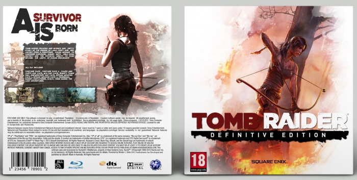
Hey Guys New Cover..^^
Template by Vince_1990
View Full..
And Plz Leave Comment And FeedBack They are more important to me than FaV..
And if u haven't check out my other design :)
[ Box updated on August 6th, 2015 ] [ original ]
 Tomb Raider: Definitive Edition Box Cover Comments
Comment on Jullrouu's Tomb Raider: Definitive Edition Box Art / Cover.
Well... I don't know what to say. I don't think i'd do enough justice if i said anything.
[ Reply ]
What U Mean By Justice..?
[ Reply ]
@Jullrouu I mean it's great. but saying "it's great" is an understatement. maybe i should just have opened up with Nice work instead.
[ Reply ]
@Pharaoh
OK TY :3
[ Reply ]
I like it, lovely effect while using the negative space makes it a great design
[ Reply ]
Thanks Vince..(:
[ Reply ]
I love the back! It looks so nice!
I'm not a huge fan of the front, it just feels kind of lazy. It's just a bit of white space around an official wallpaper. However, it does look very nice, so overall I like the box!
[ Reply ]
I get u...
Thanks dude ^^
[ Reply ]
@Jullrouu
I just noticed, there is a spelling mistake on the back, it should say:
"Tomb Raider delivers AN intense and gritty...", not "Tomb Raider delivers AND intense and gritty..." ^^
[ Reply ]
@TheTombRaider
Thanks Dude I gonna fix that
[ Reply ]
Looks nice
[ Reply ]
Thanks...
[ Reply ]
Love it dude
[ Reply ]
Thanks man :)
[ Reply ]
Dude, honestly I love the cover. Highlight with great satisfaction what is Tomb Raider. The font fits perfectly. It has very nice details and looks great. The front is simply a Wallpaper, but I like it. Honestly, something of their own (one of your design) and different bad will not come to the front cover. Good job ;)
[ Reply ]
Thanks Warsony...
And the front is edited...
It's actually 2 wallpaper :)
[ Reply ]
This turned out lovely.
[ Reply ]
Thank dude...
[ Reply ]
Looks great!
[ Reply ]
TY :)
[ Reply ]
Great :)
[ Reply ]
Thanks !
[ Reply ]
Woooo, well done man. Well deserved
[ Reply ]
Thanks Vince :)
[ Reply ]
Well done man, this is well deserved ^-^
[ Reply ]
Thanks man... ^^
[ Reply ]
Congratulations bro
[ Reply ]
Thanks dud... (:
[ Reply ]
The front looks nice and the back is well organized. I would only suggest to not use all capital text for the synopsis and make it a bit more readable (a slight bigger font size) in the future.
[ Reply ]
I'll make sure my future boxes are readable by now..
Thnks Bastart :)
[ Reply ]
why cant download it ?
[ Reply ]
because downloadable version get stolen so people dont upload them.
[ Reply ]