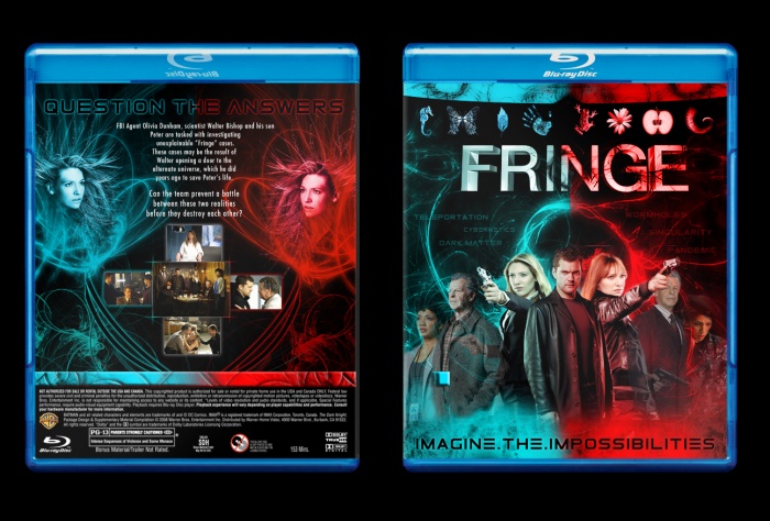
Fringe was such a great TV show I decided to make a box for it! This isn't really designed for one specific season, but (if you watched the show) I wanted to really use the theme of the parallel universes.
 Fringe Box Cover Comments
Comment on Ultraviolet32x's Fringe Box Art / Cover.
Too busy, and for me it lacks a coherent color concept. I don't like this, sorry.
[ Reply ]
I think you've done better covers, and like aldimon said, it's very busy.
Still, I do quite like it, so I'll fav ;)
[ Reply ]
I'd have to agree with the others in my opinion the blue is not strong enough to go with the Red I'd make it more of a royal blue, and personally I'd put the Fringe logo above the colour gradient to make it pop out a little so its not fully swallowed by Red/Blue having clashing colours in boxes can work but you might want to tone it down maybe add a grunge texture, because at the moment it overpowers what looks to be a pretty solidly designed box (i'd also add some more renders on the back and also put more contrast on the people in the background on the front the way they blend looks a little off aswell) But i do think this has potential! keep it up.
[ Reply ]
coooooooooooooooool
[ Reply ]
Nice work man
[ Reply ]
Thanks!
[ Reply ]