Thanks for any comments.
[ Box updated on December 20th, 2019 ] [ original ]
 The Legend of Zelda: Skyward Sword HD Box Cover Comments
Comment on Moebius's The Legend of Zelda: Skyward Sword HD Box Art / Cover.
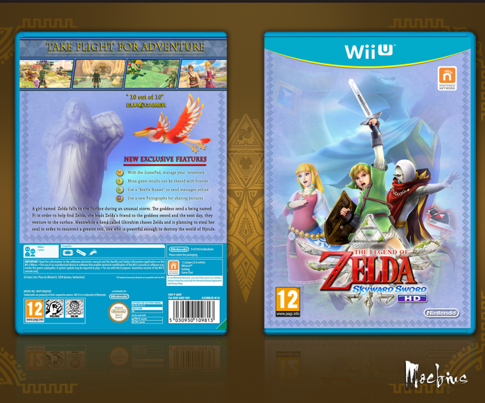
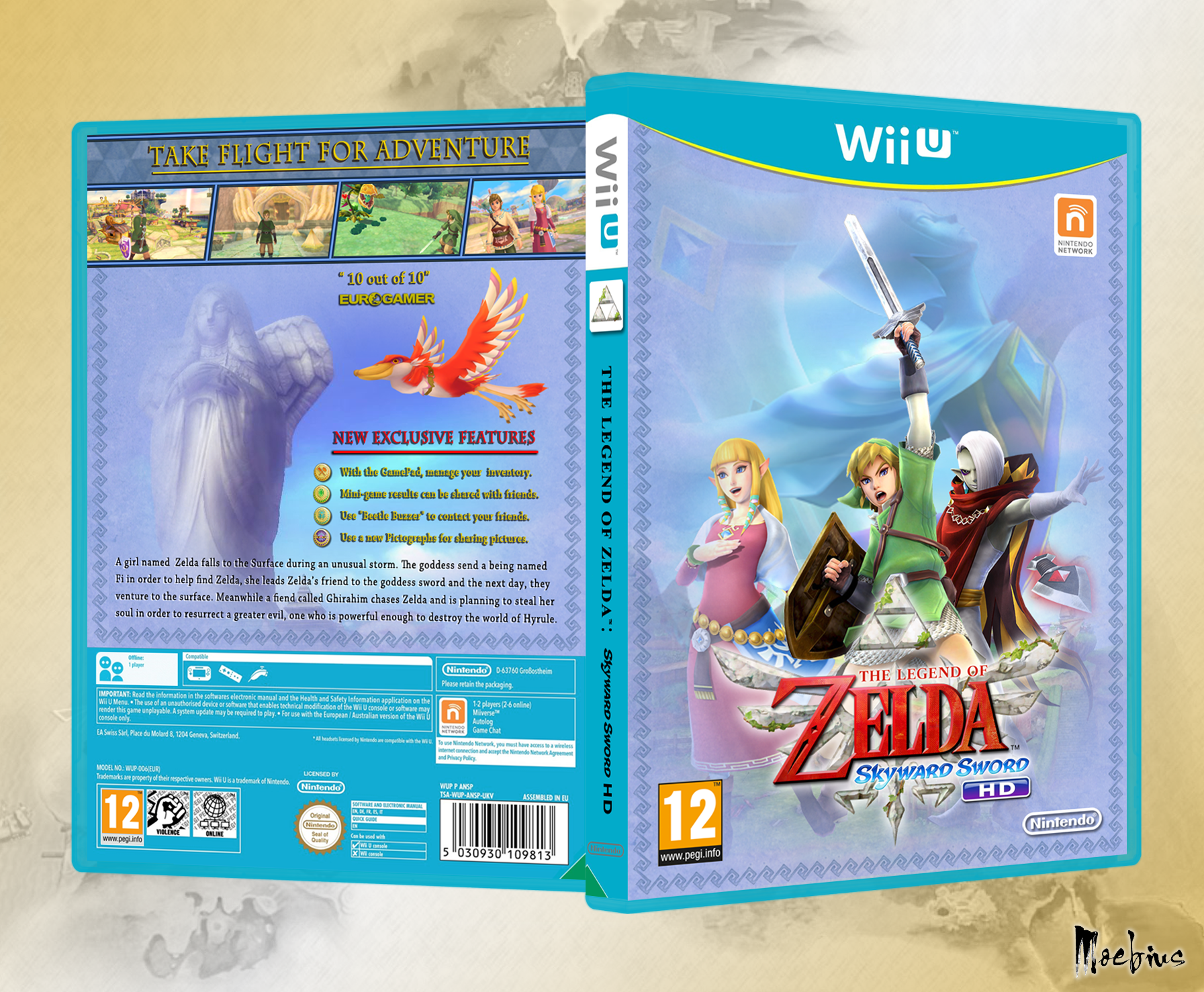
Front Is Eye Catching
[ Reply ]
Indeed it is, the only problem I see is having Zelda and Ghirahim's head's different distances from Link (i.e. to remedy this, move Zelda closer to Link)
However, your thing for having renders that aren't covered by text is causing balance problems. There's a huge part of the back which looks really empty because you've tried to show off a non-contrasted image. I'll be honest, I don't think it works as a design plan most of the time.
Font choice this time is good, but this time the problem is colour balance. There's greens on the screenshots at the top of the back but not anywhere else on the back.
I'll give another suggestion as with your last box. I'd say move the screenshots so they cover the middle of the back, slide up the picture in the background, make the tagline much larger (taglines are supposed to be eyecatching!) and put the features in the lower right as they are and fit the story text in the lower left.
At the moment you are playing your boxes far too safe and aren't experimenting as much as you should for someone with your potential.
[ Reply ]
@Sarashi ^ Agree
[ Reply ]
@Sarashi I don’t know where to put green on back and like the font colours. I prefer to put space between Zelda/shield. The back's preference; I like more space to see the art.
[ Reply ]
@Moebius The font colours aren't a problem, it's the green being right at the top, which is why I recommended you move the screenshots to the middle, where it is balanced a bit more.
[ Reply ]