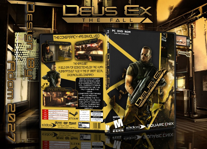
Nice thinking but I think that the back needs more work by -
U have stretched the screenshot on the back ..
And I think that font is not too good by point of view
To improve I would say some of the design is quite close to the edges. Dont ever stretch photos or renders, logos etc... Also some of the dev logos are quite big...
I would say have a look around this site and get some inspiration from other designers and their work and apply it to your own style. You can always use the forums to get feedback before posting fututre cases.
For a frist case I would say this is pretty good and quite creative. better than my first case (now deleted). Will keep an eye out for more from you.
 Deus Ex:The Fall Box Cover Comments
Nice thinking but I think that the back needs more work by -
U have stretched the screenshot on the back ..
And I think that font is not too good by point of view
[ Reply ]
thanks for your comment.
updated.
[ Reply ]
Good work for first box
But need more work
Keep it
[ Reply ]
thanks for your comment.
[ Reply ]
To improve I would say some of the design is quite close to the edges. Dont ever stretch photos or renders, logos etc... Also some of the dev logos are quite big...
I would say have a look around this site and get some inspiration from other designers and their work and apply it to your own style. You can always use the forums to get feedback before posting fututre cases.
For a frist case I would say this is pretty good and quite creative. better than my first case (now deleted). Will keep an eye out for more from you.
[ Reply ]
thanks a lot for your helpful comment.
updated.
please visit my new cover art.
[ Reply ]
So Good For First One But Character One The Front Is Scratched. You Can Fix That.
[ Reply ]
thanks for your comments.
updated.
[ Reply ]
wow plz the cover e3 2015
[ Reply ]
sorry.what do yo mean?(bebakhshid manzoreton ro az commenteton nafahmidim.lotfan vazeh tar begid. man dar khedmatetonam.)
[ Reply ]
سلام اگه دوست داشتین میتونید کاورهاتون رو برای ما بفرستید و توی سایت ما نمایش بدید :
www.ircover.lxb.ir
[ Reply ]