New box!
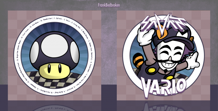
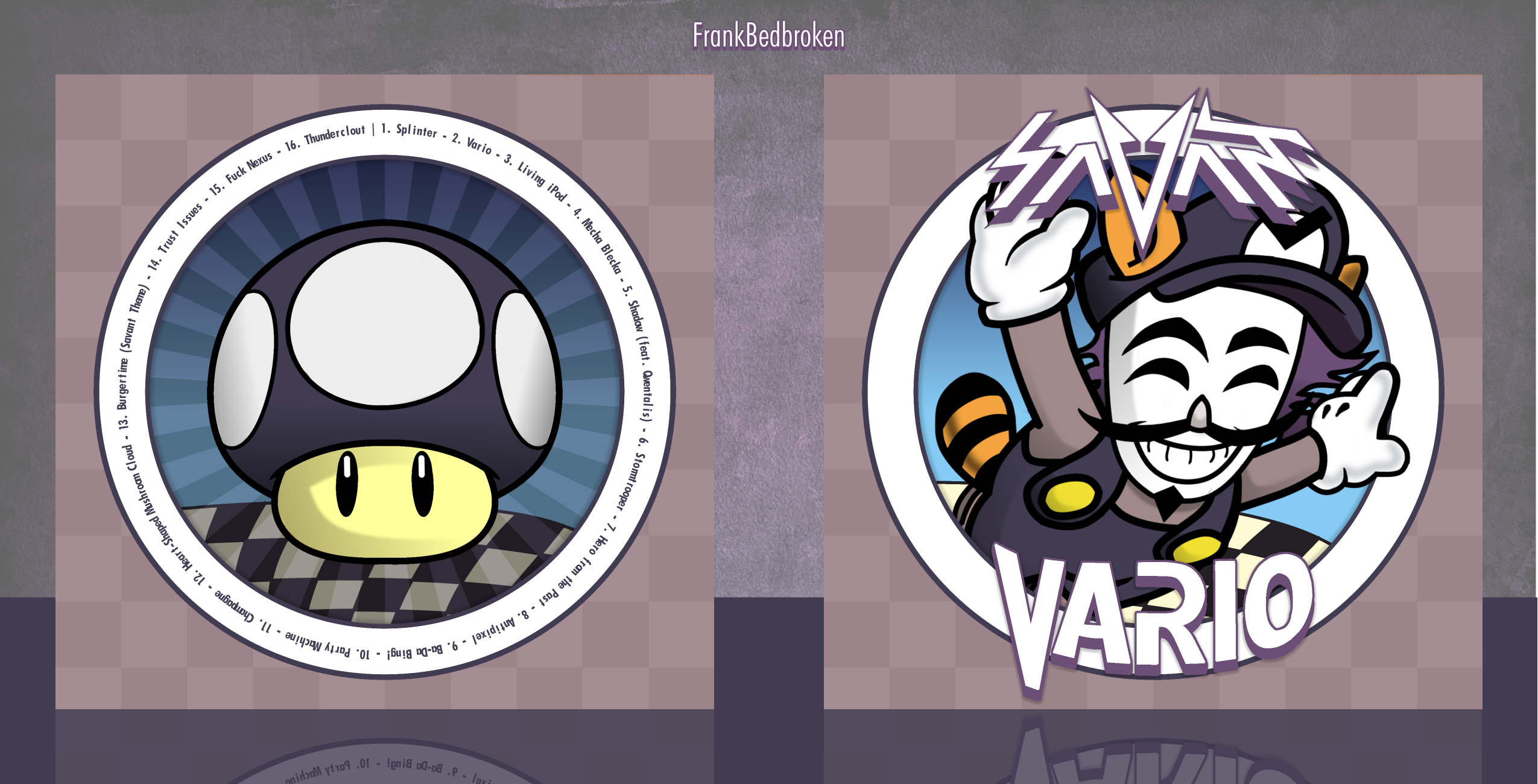
Well, here's another box for Martin's comp. This time's the box for (another) electronic music artist called Savant, his main gimmick is that he uses the Guy Fawkes' mask on stage while playing, and he has a character called Vario, on which he based a whole album towards him by the same name (I think you can see the inspiration behind the character).
As always, constructive criticism is welcome and huge thanks to lucidhalos and Ulquiorra for the help and the feedback, it's greatly appreciated!
Hope you guys like it! :D
[ Box updated on June 28th, 2015 ] [ original ]
 Savant - Vario Cover Comments
Comment on FrankBedbroken's Savant - Vario Cover.
I like it!
I can see that you've gone for a purposely simple design however I think it might be slightly too plain? That's only a slight nitpick though, because the actual design work is flawless. Good job, Frank :D
[ Reply ]
Thanks, Nathan! :D Yeah, I did noticed that it lacked something but I didn't knew what else to add to it, what do you think I should do to make it less plain?
[ Reply ]
@FrankBedbroken
Honestly, I really don't know... This wouldn't contribute to making it seem less plain but I just noticed something. I think you should have added the sun ray-like pattern that's on the blue part of the back to the blue part on the front too because the front looks a little bright in comparison. I don't know if that was intentional or not, but I think they would look better wither both bright or both darker (I'm talking about the part inside the circle, btw)
[ Reply ]
@TheTombRaider I can see what you mean, I'll see if it looks better with the sunray pattern on the front, or without it on the back.
[ Reply ]
Looks great! I think that the Savant Logo isn't entered and its kinda hard to read. I saw it on the WIP but I had no feedback then. Nice work tho :)
[ Reply ]
Thanks, HyperBoy! :D The logo's originally like that, so I really couldn't fix that.
[ Reply ]
Once again, you did it great ;)
[ Reply ]
Thanks, Ulquiorra! :D
[ Reply ]
Updated! Tried to make it so the box had the same level of brightness throughout. What do you think? Is it better? Is there something else to fix?
[ Reply ]
Update looks good Frank! I don't have any improvements, I think it looks great as it is, despite me saying it was a little empty beforehand :)
[ Reply ]
Very Nice FB :-$
[ Reply ]
Thanks. :-$
[ Reply ]
Nice dear
[ Reply ]
Thanks... dear?
[ Reply ]
I love the simplistic look and the colors used.
[ Reply ]
Thanks, Phunk! :D
[ Reply ]
Love the character and the box, the face reminds me of the V for Vendetta mask. Well I guess now it's V for Vario. Did u draw him because the art is really good.
[ Reply ]
Thanks, Ranman! Yeah, the Guy Fawkes mask is the main gimmick of the artist. The body on the front has been retraced from a Mario render and the face and hair is custom, and it's been recoloured.
[ Reply ]