![]() »
»
thanks for the render link
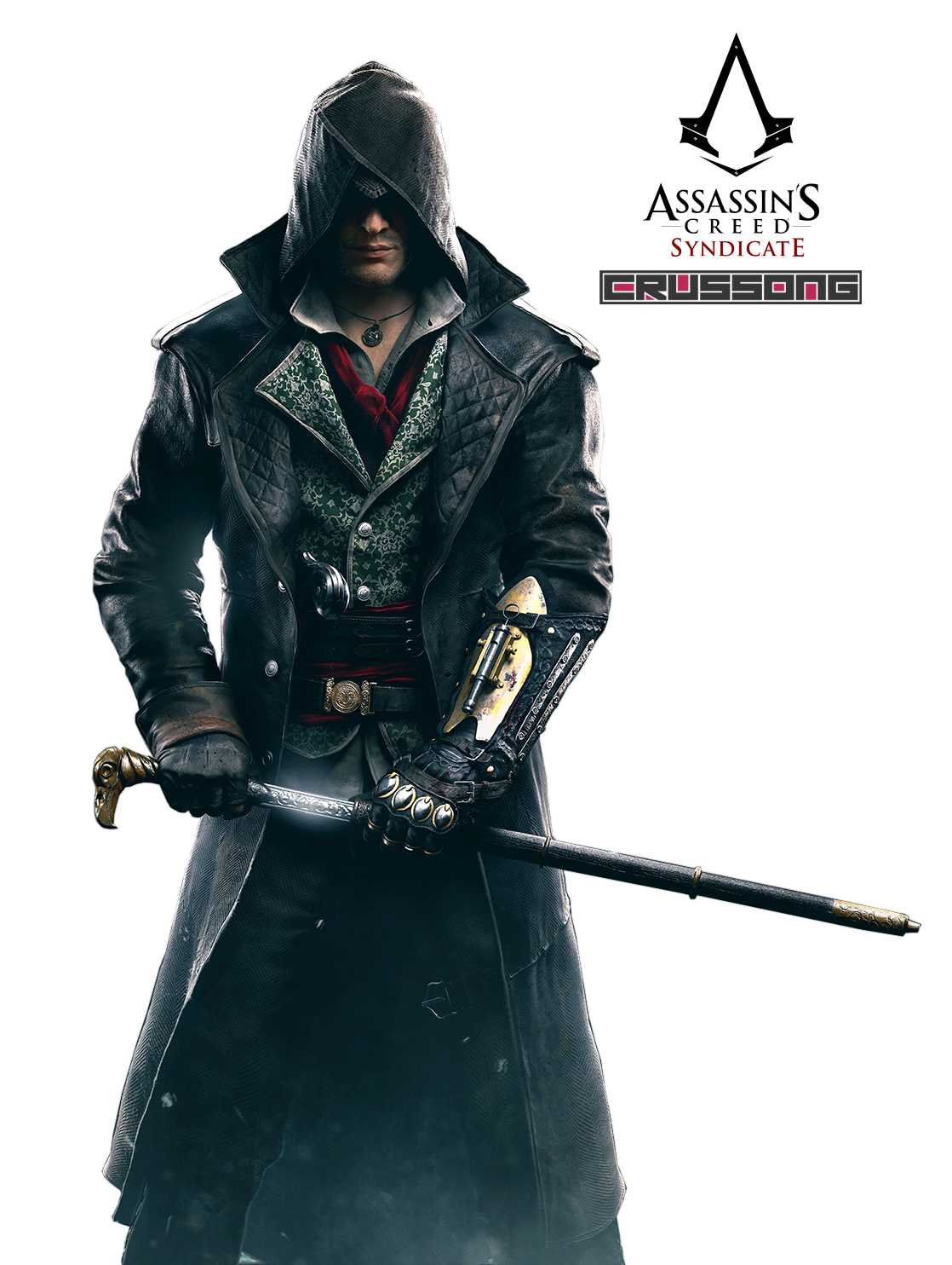
render edited by me ( here you can see how : link )
and this render : link
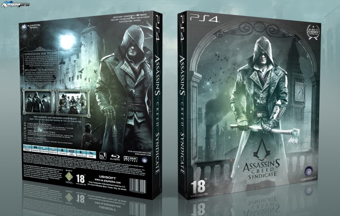
[ Box updated on May 20th, 2017 ] [ original ]
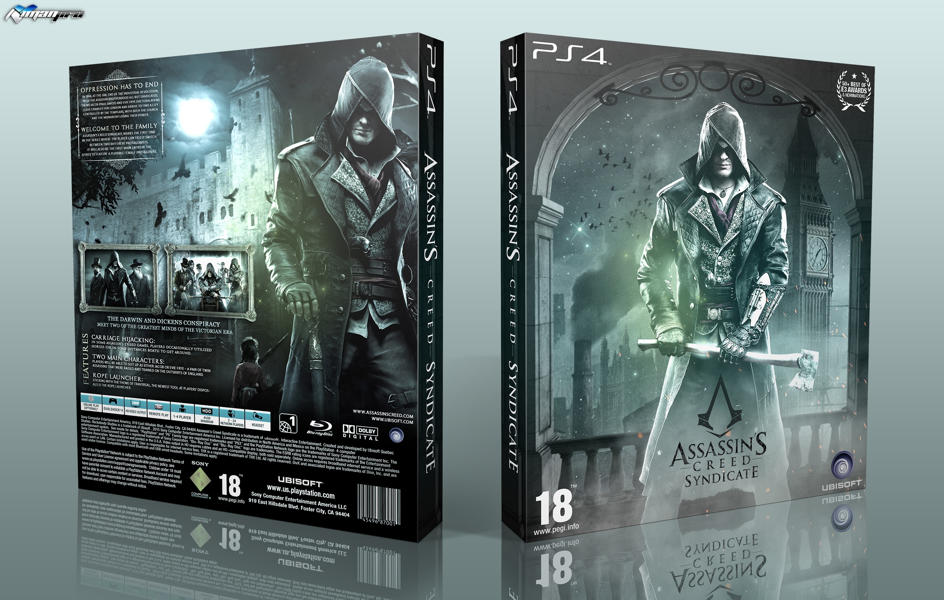
 Assassin's Creed Syndicate Box Cover Comments
Comment on iman pro's Assassin's Creed Syndicate Box Art / Cover.
You know it's actually amazing seeing how much you've improved, Iman. Comparing this to your very first covers makes the difference quite obvious. Amazing job on this one, I love it :)
[ Reply ]
OMG
Love the border on screenshots and text very nice colout scheme really very nicenice.
[ Reply ]
The text is way too small on the back, if it were bigger then I think this would be a very good box.
[ Reply ]
As Assassin Creed boxes go this is actually really nice. I like the colours and the atmosphere alot,
though I feel like the structure of the back is a little unusual makes it feel super empty in parts like Sarashi said I feel like the text is way to small..if I were you I'd enlarge it and make a more Interesting tagline above it to fill up the box.
regardless nice box Iman keep it up! =)
[ Reply ]
prefect
[ Reply ]
I agree with Tomb—it's amazing to see how much you've improved in the last year. I'd also like to say I agree with Sarashi when it comes to the back of this box. I can see why you chose to put the text on the top left corner (since the moon is really bright). I think if you broke down the content into two seperate boxes it may help fill the void a bit and perhaps add a headline of some sort? Other than that, I think you did a really good job with the typeface and images. Good job.
[ Reply ]
thanks to everyone for comments (Special Paper and lucidhalos )
box updated , I hope you like it :)
[ Reply ]
Here it is! Looks great dude!
[ Reply ]
Looks awesome man :)
[ Reply ]
Cover slightly opaque and dark color schemes are dear friend to me
[ Reply ]
Congrats bro
[ Reply ]
nice ;)
[ Reply ]