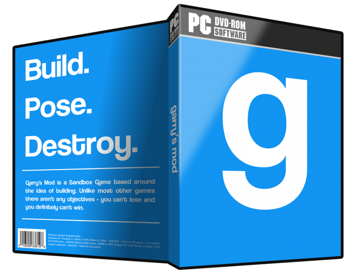
I was going for a very simple, minimal design (my first attempt at this style). Let me know what you think about the whitespace usage.
The font used in the Garry's Mod logos and throughout this cover is Coolvetica: link
The "g" on the front is one of the Garry's Mod logos. It is simply the lowercase "g" in Coolvetica.
"garry's mod" on the spine is the other Garry's Mod logo. Again, simply the text in Coolvetica.
"Build. Pose. Destroy." I think are the best 3 words to describe the game. The text blurb below that was taken from the front page of the Garry's Mod website (garrysmod.com).
You can find these and the PSD for this cover at the link below. Feel free to edit and re-upload and do whatever you want with it: link
 Garry's Mod Box Cover Comments
Comment on yo1dog's Garry's Mod Box Art / Cover.
I liked it. It's so simple, makes me wonder if this plainness is to show how garry's mod can be very "destructive"
[ Reply ]
You know what would be cool; if a couple of squares of the g on the front were missing with them piled by the bottom of the box as if they had fallen off the letter itself. Maybe some scaffolding up around some other part of it so it looks like you are constructing something. At the moment it looks too plain. It really helps to convey what the game is about as simply as possible in boxes like this where there aren't characters to rely on.
[ Reply ]
That's a cool idea, I don't know if I have the artistic talent for that. You should do it! PDF is linked in the description :)
[ Reply ]