![]() »
»
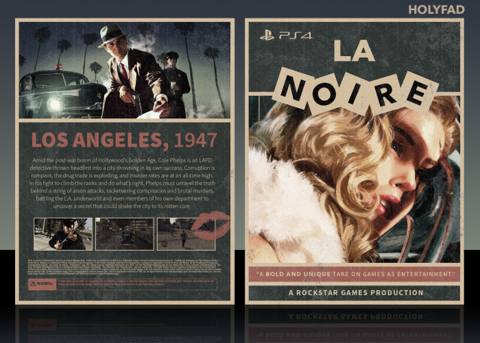
So here's a cover I made for L.A. Noire. I started the front in February or around then, decided to start working on it again recently. Thanks to the guys at WiP for helping me out.
 L.A. Noire Box Cover Comments
Comment on HolyFad's L.A. Noire Box Art / Cover.
Looks dope. I would've liked to see the squares for the tagline but it's a nitpick, this is dope.
[ Reply ]
Freaking love this concept, looks awesome!
[ Reply ]
seriously cool stuff, dig the colours used so much.
[ Reply ]
Looks awesome!!
[ Reply ]
The front is fantastic, I really love it. The back is really nice too, I just prefer the front. Well done man
[ Reply ]
I like the look on this, especially the color sheme and clean layout on both the back and front. Although I like that you've tried something different with the L.A. Noire logo, i still prefer the original neon design (this block design reminds me of a 'toy store') which doesn't go well with an image of a murdered woman :\
[ Reply ]
Yeah, I get what you mean. The block design was inspired by a poster, can't seem to find it now. I prefer the neon design as well but it definitely didn't fit in with the aesthetic of this cover.
[ Reply ]
well done
[ Reply ]
well done , well deserve HolyFad
[ Reply ]
Congrats!
[ Reply ]
Congrats dude
[ Reply ]
Thanks for the HoF, everyone.
[ Reply ]
Not a great fan of the logo. It looks like something from a board game... like Scrabble. Great design nonetheless.
[ Reply ]