so excited for this game lmaooo
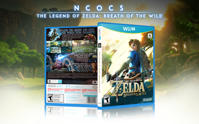
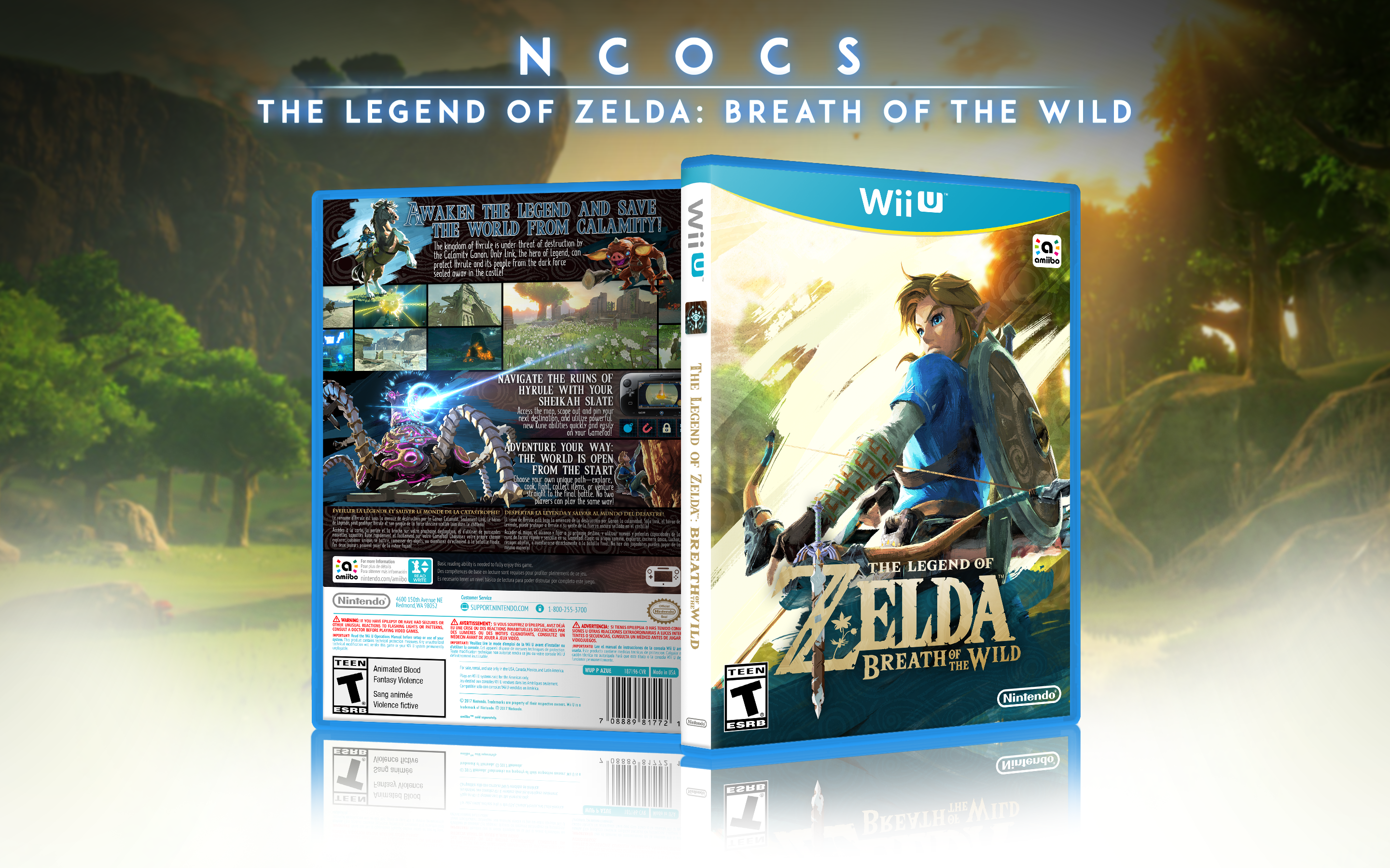
nintendo's box was really bad so i thought i'd make my own!
this was probably the most fun i've ever had making a box! my excitement for the game kinda trumped any frustrations that may have come up while making it haha, and as i was nearing the end it became more of a puzzle trying to get all the elements to fit, which was also pretty fun!
I did edit the logo quite a bit lol, the official one is a totally-flat beige, and i didn't feel like it meshed very well with the design i had in mind.
NOTE: yeah sorry there's a little gap that i missed when masking link out in the climbing art. i tried to update both the display and the printable but it doesn't seem like they're gonna go through
NOTE2: and it actually went through finally! should be all good now
most of the images came from Zelda Wiki's BotW gallery: link
used EdwardPines' template: link
used Iman pro's display box: link
all the rest of the art and screenshots and such came from nintendo's e3 2016 press kit!
[ Box updated on June 17th, 2016 ] [ original ]
 The Legend of Zelda: Breath of the Wild Box Cover Comments
Comment on ncocs's The Legend of Zelda: Breath of the Wild Box Art / Cover.
This looks so amazing and official looking! Great job :)
[ Reply ]
the unedited logo was in the e3 press kit! I think Zelda Wiki has it up on their BotW gallery page as well!
[ Reply ]
The design looks great overall, though I do think the back's layout is a tad too crowded. I think you should reduce the size of the font underneath the screenshots, but otherwise I like the choices you made with the layout. Giving you an extra thumbs up as well for not using YoshiStar's Wii U template
[ Reply ]
reduce the body font or the headline font? or both?
(and thanks !! lmao)
[ Reply ]
Reduce the size of the body text, but either increase the leading or keep it as is. The body text is overlapping each character with the line spacing it has currently.
[ Reply ]
@Nerdysimmer alrighty, fixed! can you spot anything else?
[ Reply ]
this looks awesome, really great job. the back is a little text heavy, though.
[ Reply ]
tried to make it really official-looking, so i pulled out my TPHD box for reference--i'm actually using less text on the back than nintendo did on that box lmao
[ Reply ]
@ncocs oh really? i haven't seen the box for that game so i wouldn't know, but in that case, there's nothing to complain about - amazing job! XD
[ Reply ]
shit dude this is amazing
[ Reply ]
thanks!
[ Reply ]
I agree with Nerdy on everything and I'm not a fan of the choppiness but I'd be damned if I didn't say this isn't really good.
[ Reply ]
choppiness with like, the brush strokes? yeah i'm not a *giant* fan of that either, but all of nintendo's art for the game has colored brush strokes layered in behind the main focus, so i thought rather than fuck all that up, i'd try to blend it in and make it part of the design. the front is definitely the most visible example of that
[ Reply ]
nice work yo
[ Reply ]
thanks so much!
[ Reply ]
Awesome. This should be the official box art.
[ Reply ]
thanks !!
[ Reply ]
Great job, man! I was wondering if it was possible for you to make a version without the rating. I wanted to put my own country's (Australia's) rating system on the box.
[ Reply ]
when i have the time, i'll take a crack at it! does australia use PEGI or do they have something different?
[ Reply ]
@ncocs Sorry for taking so long to reply! Australia uses the Australian Classification Board (ACB), and I presume the game will be rated "M". Thanks for listening!
[ Reply ]
@NeonSpectre i'll look into changing it! i can't guarantee i'll get around to it any time soon but i'll note this on my to-do list!
[ Reply ]
You should do one for the NX when they finally release wtf that shit looks like
[ Reply ]
HoF
[ Reply ]
one can only dream haha
[ Reply ]