Here is a Box of a Possible My Little Pony Game for Wii U! Vectors used belong to SnoopyStallion, Silentmatten, MLP-Starblaze, Lethal-Doorknob, elegantmisreader, DrFatalChunk, LainLycoris, MLPVectors203, and Jakeneutron on deviantart. The Wii U Box Template belongs to YoshiStar, here on VGBoxart. Tell me what you all think! I'd love to hear your opinions!
 My Little Pony: Adventures in Equestria Box Cover Comments
Comment on TwilightSparkleFan99's My Little Pony: Adventures in Equestria Box Art / Cover.
Word of advice: unrelated to the box; Alex Gozdecki is an idiot. Don't listen to idiots.
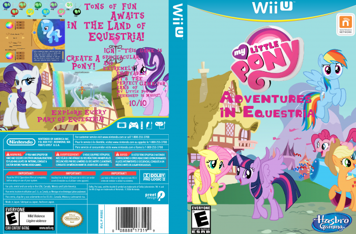
Related to the box: I think that some more work could be put into the appearance of the text, and resolution of the images. the characters, and text all have a white outline that could be removed.
I would also recommend using a different font for the IGN quotes and whatnot, something smaller. Changing the color to make it legible would be good, too.
I get that you put a lot of care into this, and why you may be offended at people not liking your box (Hell, I was the same way when I started), but JengaSoft is right. Criticism is important. Even if what he said wasn't very helpful.
Don't take it so much as an attack and use it as something to help you in future designs. Out of curiosity, what program do you use?
[ Reply ]
^ This
[ Reply ]
I use MS Paint. And besides, for the IGN Review, and pretty much everything else, I used MLP font, being that it's an MLP Game.
[ Reply ]
@TwilightSparkleFan99 I understand the font choice, but typically you'll want to use more than one font on your design. The current font is fine for the tagline, but better, when dealing with descriptions, to run a smaller font then the tagline. It looks less muddled.
I personally would recommend a better program, such as Photoshop, if you can acquire it. There are free alternatives, too, such as Gimp and Paint.net. If you get the hang of it I'm sure you'll find one of them better than MS Paint.
[ Reply ]
@Sonic the Hedgehog Well... Are there any programs that are similar to MS Paint, and feel like MS Paint, but can make a good boxart? Because, I'm really experienced with MS Paint, and switching to a new program with different tools would be really confusing.
[ Reply ]