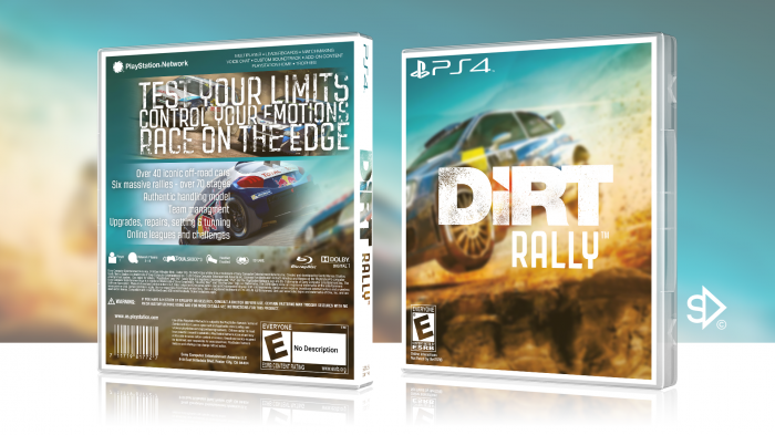
Prefer this more than your previous DiRT box, not a fan of the white car in the back though and main text might need tweaks but other than that, I like :)
The presentation, template and the overall box looks nice. I'd only suggest to add some screenshots of the game in the car silhouette (at the moment it hasn't really got a purpose, rather than being just a filler and a plain white rally car)
The front and spine look great. I love the treatment, but the back is a bit lackluster in comparison to it. It's too streamline in comparison to the bit of grunge that the logo has. I think you need a bit of that on the back, as well as bringing some of that orange tint. The headline on the back is nicely done, but it eats up a lot of your room and leaves you very limited on what you can do. The silhouette of a car draws way too much negative attention, due to just how heavy it is in comparison to the narrow typography. I'd consider substituing it for some screenshots and tweaking your summary text. That big amount of space after team management looks…odd. But overall, you have some nice things going on here. You definitely nailed the front and your composition of the back does work quite well. Just needs a bit of adjusting.
 Dirt Rally Box Cover Comments
Prefer this more than your previous DiRT box, not a fan of the white car in the back though and main text might need tweaks but other than that, I like :)
[ Reply ]
I agree.
[ Reply ]
what is it ...
[ Reply ]
It's you, eating dirt...
[ Reply ]
nice
[ Reply ]
The presentation, template and the overall box looks nice. I'd only suggest to add some screenshots of the game in the car silhouette (at the moment it hasn't really got a purpose, rather than being just a filler and a plain white rally car)
[ Reply ]
shut up you loser leave your advice to yourself they are not wanted.don't act smart and clever designer
[ Reply ]
@Deadpool Noted.
[ Reply ]
The front and spine look great. I love the treatment, but the back is a bit lackluster in comparison to it. It's too streamline in comparison to the bit of grunge that the logo has. I think you need a bit of that on the back, as well as bringing some of that orange tint. The headline on the back is nicely done, but it eats up a lot of your room and leaves you very limited on what you can do. The silhouette of a car draws way too much negative attention, due to just how heavy it is in comparison to the narrow typography. I'd consider substituing it for some screenshots and tweaking your summary text. That big amount of space after team management looks…odd. But overall, you have some nice things going on here. You definitely nailed the front and your composition of the back does work quite well. Just needs a bit of adjusting.
[ Reply ]
i'm not a big fan of your this design but appreciate your effort on this one
[ Reply ]