When I heard of the announcement on the DLC expansion for Little Nightmares, I got quite excited (that's exactly what I wanted, more of an already intense game that was short, but sweet)
I already wanted to make a box for this game at launch in April. I started something, but I never had the material or ideas to do so later on. When I heard they'd make a complete edition (which includes the Secrets of the Maw expansion)
I went back to it, picking it up again and eventually finished it.
Credits go to Scorpion Soldier for the PS4 template and eggboy'13 for the spine plastic.
 Little Nightmares: Complete Edition Box Cover Comments
Comment on Bastart's Little Nightmares: Complete Edition Box Art / Cover.
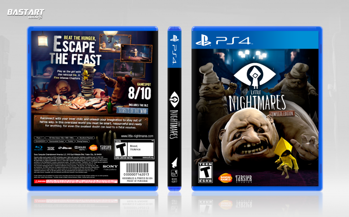
I think front isn't good. there are many nice characters in this game but you used some funny fat characters. U could do better for background on back.
Back is better than front. You could do much more.
[ Reply ]
First of all Inner black shadow on sccrenshot doesn't work it make them opaque and unseen, After it you put all logo close in left side and you let right side empty, At the end gamespot score is too big. A little smaller would work better . . .
I feel you make text and character bigger to fill in empty spaces and there isn't nothing new in it, Other than that, not bad at all . . . :)
[ Reply ]
Nice job with the in-depth illusion made by object placement and overall layout for the design. It's clean and efficient.
[ Reply ]
Thanks for the comments guys.
[ Reply ]
Yo honestly, that back had me gaping. Real nitpick aside from that, the front has a little strange absence of shadow under the little yellow guy, nbd though you've really wen't crazy on this design here.
[ Reply ]
Tidy design, I like how creepy the front is.
[ Reply ]
Ugh. I love the back of this, mainly because that little subtle detail with the depth is nicely executed. I will nitpick that shadow at the bottom though—I wish it was a little lower or a little less harsh, mainly because the edge seems a bit sharp and the way it's effecting the summary for it is bugging me.
I also like the front and love that you captured the feel of the game with the composition. Great work.
[ Reply ]
Love it. Creepy tho...
[ Reply ]
Oooooooook & perfectfull
[ Reply ]
This is strange...But I love it. That guys face lol
[ Reply ]
Not sure how I missed this - I love it! The back looks like an official design because of how well structured it is. My only nitpick is the little yellow guy on the front, he seems too bright compared to everything else and draws on too much attention. Aside from that, excellent work!
[ Reply ]
Burn this doggy shit..
[ Reply ]
Hey Mike Tyson, chill out, write a poem and train some pigeons.
I think that user called deadpool, has another alias (I wonder how long he'll survive on here?)
[ Reply ]
Thank you guys, I'm of to go burn this doggy shit.
[ Reply ]
nice plz Printable
[ Reply ]
I really liked the front and the back is very well composed
[ Reply ]