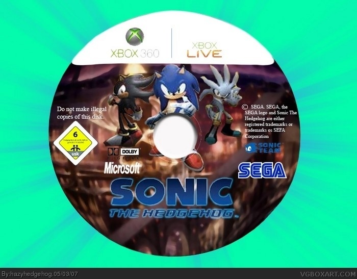
-logo looks odd.
-sonic team logo isn't cut out.
-microsoft logo is stretched.
-the renders look bad.
-dolby ditigal logo looks crap.
-the template looks too white at the top.
-the copyright info looks bad, use a font like Arial, not Times New Roman.
 Sonic The Hedgehog Box Cover Comments
omg i spelt disk wrong =S ooops ignore that
[ Reply ]
hmmmm....
-logo looks odd.
-sonic team logo isn't cut out.
-microsoft logo is stretched.
-the renders look bad.
-dolby ditigal logo looks crap.
-the template looks too white at the top.
-the copyright info looks bad, use a font like Arial, not Times New Roman.
and most importantly.... where's the box?
2/5, sorry
[ Reply ]
#2, i second everything you said
[ Reply ]
disk isnt even round
[ Reply ]
i dont cut things out, i dont need to, i erase around it, so it basically is cut out.
[ Reply ]
#2,
Same here.
Anyway, why is this on satire? Satire means it's supposed to be funny.
Plus, you forgot the CD edges. That's one of the most important layers of a game disc.
Next time when you're making a game disc, make a box art with it. the site is called Video Game "BOX ART".
[ Reply ]
#2 & #6 are right.
[ Reply ]