Many years ago, 13 year old me was just learning the basics of Photoshop 7, when my friend showed me this site. My first covers where nothing special, some being outright bad. I was sort of cast aside by the community as being 'another sonic n00b', but I kept at it, and after a few months, I started to get a little bit better.
I uploaded this cover, link and updated it several times. Even that box is nothing special, but it represented something much more than just a box; it was a creative milestone.
Sometimes I wonder if I have wasted my youth making this stuff. I remember trying to explain to people why I do what I do, and I could never really come up with a solid answer. Other kids my age where out having fun, but somehow I found so much joy in making mock up box designs for video games.
 Super Sonic Galaxy Box Cover Comments
Comment on Sonic the Hedgehog's Super Sonic Galaxy Box Art / Cover.
i was also a sonic n00b when i joined like 10 years ago, so I relate! my boxes back then are similar to your original one, but we've both improved leaps and bounds!
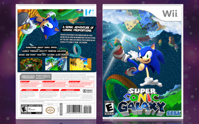
a few things:
the front—the logo and the sega wordmark are too close to the edges of the canvas. the ESRB is fine, but you're creating unnecessary tension by keeping stuff so close to the edges, especially something as crucial as the game's logo. I'm really loving the background—it feels really solid and definitely gives off a "galaxy" feel, but sonic isn't integrated into it well enough. something about the way his hand is hovering above the logo instead of interacting with something either in the background or the foreground. the placement of that render is also really awkward—it's just off-center in a way that doesn't feel deliberate. otherwise, the front feels really solid!
the back—imagery is great, and is consistent with the front. the typography is a liiiiittle iffy, specifically the body font. the header is a choice, and not one that I can say is good or bad, but the body font isn't easily read—start by moving away from caps; they're the hardest to read. the screenshots could also use a legitimate treatment instead of just being placed at the bottom.
all together, though, you did a fantastic job and have improved SO much. it's nice to see another sonic n00b keep at it, haha
[ Reply ]
Well, shit. I didn't expect to get an actual critique. I'm not going to lie, I made this in a few hours, and I cut a lot of corners in the process. I think I've just reached the point where I want to get my ideas out there, rather than worry about if it's perfect in smaller areas. I don't have as much time as I did, back then, after all. I'm inclined to agree with you about the Sonic render, as I debated on using it in the first place, but I settled on this one, because it was from Lost World, and he was jumping.
The font I was using doesn't have lowercase letters. I can't be damned to find a replacement, as most of the good ones are locked behind a paywall. If it helps explain my decision at all, I was going for this type of design link which is already a clusterfuck in of itself. I just tried to simplify the chaos.
[ Reply ]
Really like this . Keep up the good work with modified games for the wii. Doing cover right now for thrillville wii . Although want to change model thrillville to planet coaster since there are from same company of frontier. Idk how but figure it out soon
[ Reply ]
Thrillville art cover wii coming soon oof
[ Reply ]