yeh i might. ;).
btw i opened it again, and it "popped up" as only a background.Does anybody know how to fix it and make the layers come back, or do i have to re-layer it completely? in that case i'd better make a new 1.
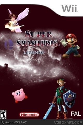
I think legends is misplaced i also think u should make legends the same color as Mario smash bros logo
About the characters i also think that if u do some 3d and some art that would be sucky
Better to make all art or all 3d right? but ive already told that
Also about link i think he is also in the way of the logos ^^
But this is still good since its your first day using photoshop and making a box
About the layers u must save ur picture as a PDF file not JPG if u want to save the layers and stuff
But i already told you on msn xD anyway
Good Luck Ayron!
Thanks haji,
first of all. i know some error's are in this box.
and with some, i mean alot.
but i dó believe i tried my utmost in making it what i wanted it to be.
i've finished my updater-y update.
#12..dont put the guys in the corners and dont have them cut off from the boundaries of the box. the teen logo is stretched. those are some things to fix up. but overall, everthing is just random (the feather, target thing or w.e it is in the corner)
#25, I could've deleted all of my older boxes, but it's just a reminder for both me and other artists that there's always a way and room to improve =].
 Super Smash Bros Legends Box Cover Comments
t logo is too small. plain and boring. characters are floating, and legends is too small. 1/5
[ Reply ]
not very good, sorry. agreed with #1.
[ Reply ]
Lol k. ty for the help.
you could be more supportive than degrading.. it's only my first one though.
check the 'templates only'part for the wii temp.
[ Reply ]
alright, well i didn't know it was your first. just put something in the background, and make sure no guys are floating. that will make it better.
[ Reply ]
ok, thanks alot for your help , i'll try to update.
[ Reply ]
oh, and try adding some more characters. since it's legends, try putting in pikachu, bowser, dk, and some other guys that have been in the games.
[ Reply ]
yeh i might. ;).
btw i opened it again, and it "popped up" as only a background.Does anybody know how to fix it and make the layers come back, or do i have to re-layer it completely? in that case i'd better make a new 1.
[ Reply ]
Ow and this isn't right, in the lower right corner is "Pal" But you use the Esbr rating. But that can be fix'd quickly ;)
[ Reply ]
ah yeh. ty for noticing. =]
[ Reply ]
I think legends is misplaced i also think u should make legends the same color as Mario smash bros logo
About the characters i also think that if u do some 3d and some art that would be sucky
Better to make all art or all 3d right? but ive already told that
Also about link i think he is also in the way of the logos ^^
But this is still good since its your first day using photoshop and making a box
About the layers u must save ur picture as a PDF file not JPG if u want to save the layers and stuff
But i already told you on msn xD anyway
Good Luck Ayron!
[ Reply ]
Thanks haji,
first of all. i know some error's are in this box.
and with some, i mean alot.
but i dó believe i tried my utmost in making it what i wanted it to be.
i've finished my updater-y update.
[ Reply ]
link ... updated version.. it doesnt really look better. but i followed your comments.
[ Reply ]
i go with # 1 and 2
[ Reply ]
It can't be a PAL verision when it is an esrb - thing in the left corner. And It's too small to. I go with #1
[ Reply ]
#12..dont put the guys in the corners and dont have them cut off from the boundaries of the box. the teen logo is stretched. those are some things to fix up. but overall, everthing is just random (the feather, target thing or w.e it is in the corner)
[ Reply ]
i think its funny. that white is a huge space gas. ive read about it in 4th grade. its 600,000,000 miles big lol.
[ Reply ]
are you talking about the milky way?
[ Reply ]
Rofl you ppl crack me up, xD
#14,, check #12 plz ;)
[ Reply ]
oh btw, i forgot.
thanks alot for constructive msg's, it does help . keep up the commenting on new ppl.
ty.
[ Reply ]
#18 Muuutch better..
[ Reply ]
ty #20.
[ Reply ]
the background is a picture of the horse head nebula O_o
and characters are floating but it has the feel of lengedary I know you can do better
[ Reply ]
wow........
you used to suck :P
[ Reply ]
Link is from ocarina of time not twilight princess
[ Reply ]
Lol, I love seeing bad boxes from great artists! :p
[ Reply ]
#25, I could've deleted all of my older boxes, but it's just a reminder for both me and other artists that there's always a way and room to improve =].
[ Reply ]