simply ugly, back is too simple and NOT good, cover is NOT good, and the spine i wont even say it... if you want to make it better you should make a new one, there is no way you can make this good...
ok, so you should fill the back with screenshots, writing, etc. and you should also cut the first guy better so it looks like he's not going to fall out of the front. the ps2 info on the back is too small, and it would probably be better if you used non-real pictures and didn't shift the focus from picture to picture (try having just one pic, or two pics that are interacting. soo, yeah. since this is really bad, you might as well disregard my comments and just delete it before anyone faints.
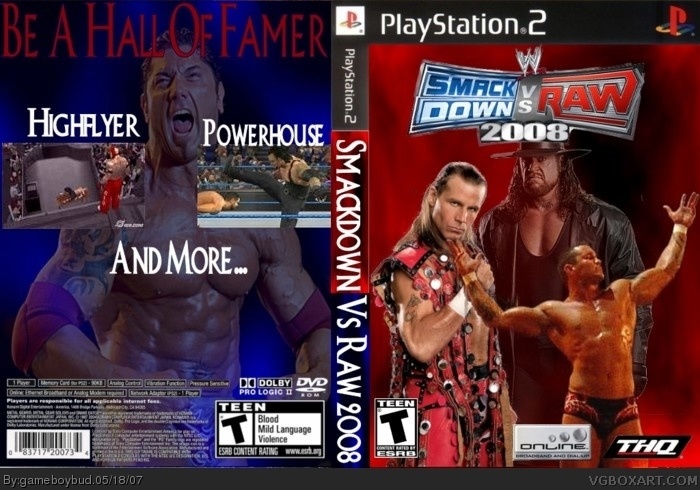
 WWE SmackDown! vs. RAW 2008 Box Cover Comments
no....
1/5
simply ugly, back is too simple and NOT good, cover is NOT good, and the spine i wont even say it... if you want to make it better you should make a new one, there is no way you can make this good...
[ Reply ]
1.5/5
Ugly, out of place. Back is too empty.
Sorry dude.
[ Reply ]
ok, so you should fill the back with screenshots, writing, etc. and you should also cut the first guy better so it looks like he's not going to fall out of the front. the ps2 info on the back is too small, and it would probably be better if you used non-real pictures and didn't shift the focus from picture to picture (try having just one pic, or two pics that are interacting. soo, yeah. since this is really bad, you might as well disregard my comments and just delete it before anyone faints.
[ Reply ]
words in back cover are too big.
[ Reply ]
the picture of the guy in the black suit on the front is overused to death.
[ Reply ]