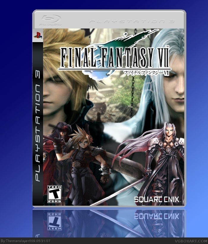
well i actually would like it better without cloud, sephiroth, and vincent at bottom. and isn't vincent a little random lol. not very creative either, i've seen a LOT of ideas like this. also T for Teen logo and square logo is weird. I HAVE MUCH FAITH IN THIS BOX lol, just fix those things and it will be perfect. but for not it's a 3/5
i think it is ok, but it resembles the dvent children movie box. and having vincent, cloud, and sepheroth at the bottom is kind of... well, not right. but its still good.
Looks better than the first version.
It got now more "harmony". The Square-Enix and the T-Rated logo are a little bit strechted, the rest pretty nice.
4 / 5

 Final Fantasy VII Box Cover Comments
3rd vg box ff 7 remake ohhh MYY!
[ Reply ]
Credit to hellknights for template
[ Reply ]
well i actually would like it better without cloud, sephiroth, and vincent at bottom. and isn't vincent a little random lol. not very creative either, i've seen a LOT of ideas like this. also T for Teen logo and square logo is weird. I HAVE MUCH FAITH IN THIS BOX lol, just fix those things and it will be perfect. but for not it's a 3/5
[ Reply ]
i really like this, but having cloud, sephy and vincy at the bottom really kills it.
[ Reply ]
i think it is ok, but it resembles the dvent children movie box. and having vincent, cloud, and sepheroth at the bottom is kind of... well, not right. but its still good.
[ Reply ]
update complete
[ Reply ]
it looks better now, but cloud looks kinda stretched. it's a nice box though.
[ Reply ]
Wow. Impressive. 4.5 out of 5.
[ Reply ]
i like how you did the blending with cloud and sephie, but the rest of the box is a very poor effort.
i guess its back to the drawing board?
[ Reply ]
i think it looks better now. sweet.
[ Reply ]
Looks better than the first version.
It got now more "harmony". The Square-Enix and the T-Rated logo are a little bit strechted, the rest pretty nice.
4 / 5
[ Reply ]