reminds me alot of one of your previouse boxes, but that aside, this is a very accomplished piece of work. The back is the highlight of the box for me, I love the set out and the frames around the screens. (How do you do that by the way?)
Did anyone notice the flying PS3 controller? Beuatiful text Wicked. It fits very well. It's so good, I'm actually speechless. High five! Get it? He, he. 5/5. Awesome stuff.
thanks guys! :) im glad to see my stuff still gets some recognition.
and btw, i meant to keep the front cover fairly similar to my previous lair box, since its pretty much going to be the official boxart.
anyway, thanks again guys, i got another one comin pretty soon....maybe... =\
This turned out fantastic. I especially love the back and how you staggered the heading and used different font sizes. My only gripe is the greenish glow on the title. Again, fantastic job. (b^^)b
I really like it. One thing is that the green tint on the logo doen't hit it for me. That aside I really see you effort in this box, one OTHER thing is that I don't like the factor 5 logo centerd. More near the sony logo would be great! Excelent work!
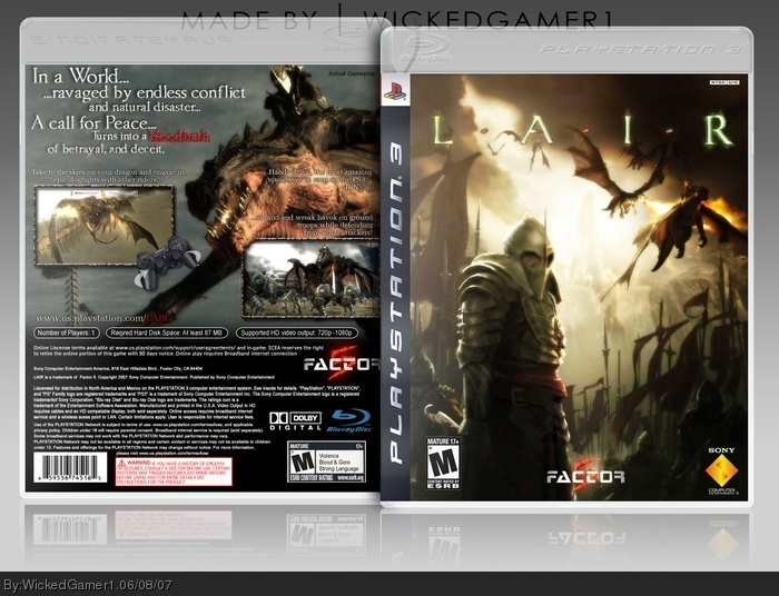
 Lair Box Cover Comments
my most favorite box ever. this thing literally took me all day to complete. luckily it was my day off. haha
plz like.
[ Reply ]
Well doesn't that just look great *smiles* great job wicked.
[ Reply ]
niiiiiiiiiceeeeeeeeeee HOWEVER i dont like the green on L A I R
[ Reply ]
I like your logo, but the front is too similar to all the other Lair boxes.
Back is smexy, though.
[ Reply ]
reminds me alot of one of your previouse boxes, but that aside, this is a very accomplished piece of work. The back is the highlight of the box for me, I love the set out and the frames around the screens. (How do you do that by the way?)
[ Reply ]
this is really good
[ Reply ]
Excellent stuff.
I like what you did w/ the text on the back.
[ Reply ]
Did anyone notice the flying PS3 controller? Beuatiful text Wicked. It fits very well. It's so good, I'm actually speechless. High five! Get it? He, he. 5/5. Awesome stuff.
[ Reply ]
Looks very officail . Nice job 5/5 !
[ Reply ]
thanks guys! :) im glad to see my stuff still gets some recognition.
and btw, i meant to keep the front cover fairly similar to my previous lair box, since its pretty much going to be the official boxart.
anyway, thanks again guys, i got another one comin pretty soon....maybe... =\
[ Reply ]
This turned out fantastic. I especially love the back and how you staggered the heading and used different font sizes. My only gripe is the greenish glow on the title. Again, fantastic job. (b^^)b
[ Reply ]
Excellent. Captures the mood perfectly.
[ Reply ]
:( this one didn't get as much attention as i'd hoped...
one of my personal (personal) faves.
hopefully this bump will help.
:)
[ Reply ]
I really like it. One thing is that the green tint on the logo doen't hit it for me. That aside I really see you effort in this box, one OTHER thing is that I don't like the factor 5 logo centerd. More near the sony logo would be great! Excelent work!
[ Reply ]
stunning box, i like the idea of the sixasis pad and also the screenshot frames are good too. fav
Edited at 1 decade ago
[ Reply ]
Holy Shit!
[ Reply ]