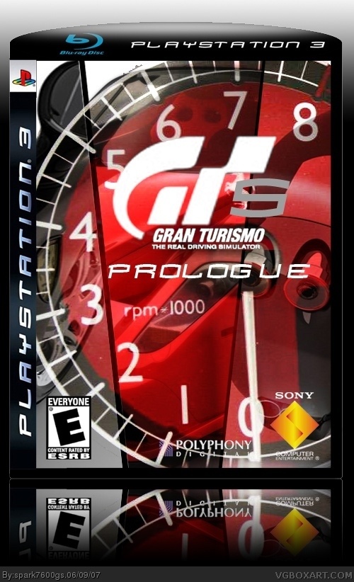
[ Buy Gran Turismo... at Amazon ] By spark7600gs 26 on June 9th, 2007 No Printable Available [ Box updated on June 19th, 2007 ] [ original ] Gran Turismo 5: Prologue Box Cover Comments Comment on spark7600gs's Gran Turismo 5: Prologue Box Art / Cover. Cancel Reply WickedGamer1 37 [ 1 decade ago ] really cool concept, but the 5 is hard to see. try putting a drop shadow on, and maybe use a different font. oh, and lower the opacity of the reflection. a lot of people get that wrong. [ Reply ] xcamelriderx95 1 [ 1 decade ago ] It is hard to see...but it is very good! 4.5/5 [ Reply ] KoopaDasher 30 [ 1 decade ago ] This is so unbelievably kick@$$ that I think I just wet myself out of pure joy. :-p [ Reply ] dell9300 17 [ 1 decade ago ] The background is a bit too distracting as the logo is quite hard to see, but other than that, very nice! 4/5 Edited at 1 decade ago [ Reply ] [Deleted] [ 1 decade ago ] Cool ! 4.5/5 [ Reply ] TrevOwnz 42 [ 1 decade ago ] nice! should have put a car in the background hitting up the apex. [ Reply ] Timmeh 32 [ 1 decade ago ] I really like the concept of this box but I think there is too much going on. [ Reply ] IceFox 42 [ 1 decade ago ] It's a good concept but it almost impossible to figure out what is actually going on. The logo isn't too hot either, kinda blurry. 3/5 [ Reply ] maxmontezuma 1 [ 1 decade ago ] I like the concept too, but as #7 already said, there is too much going on. otherwise, a good one. [ Reply ]

 Gran Turismo 5: Prologue Box Cover Comments
really cool concept, but the 5 is hard to see. try putting a drop shadow on, and maybe use a different font.
oh, and lower the opacity of the reflection.
a lot of people get that wrong.
[ Reply ]
It is hard to see...but it is very good! 4.5/5
[ Reply ]
This is so unbelievably kick@$$ that I think I just wet myself out of pure joy. :-p
[ Reply ]
The background is a bit too distracting as the logo is quite hard to see, but other than that, very nice! 4/5
Edited at 1 decade ago
[ Reply ]
Cool ! 4.5/5
[ Reply ]
nice! should have put a car in the background hitting up the apex.
[ Reply ]
I really like the concept of this box but I think there is too much going on.
[ Reply ]
It's a good concept but it almost impossible to figure out what is actually going on. The logo isn't too hot either, kinda blurry. 3/5
[ Reply ]
I like the concept too, but as #7 already said, there is too much going on. otherwise, a good one.
[ Reply ]