2 things I don't like:
-Shouldn't it be on GameCube? I dunno, I guess some people make Halo PS3 boxes...
-Just add a description and give the screens borders.
But the front is sweet.
#3, Yeah i couldn't find a gamecube temp with a front and back and i couldnt find a back for one so i could make one so i figured id do the next best thing, Wii. haha.
#14, ohh,. alright i see what you're saying. Should i change the text from yellow to white then.. because unless i want it to look like a bee yellow and black dont really go together.
 Super Mario Sunshine Box Cover Comments
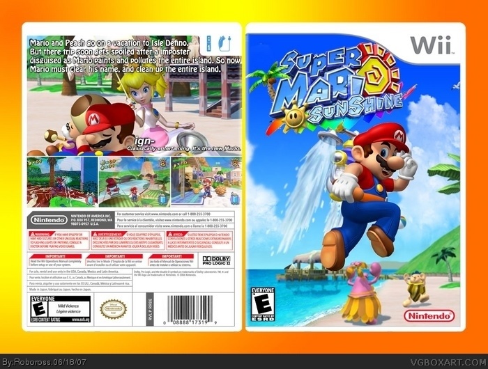
Uhh. I couldnt think of anything or how to put anything on the back so if you want to give me ideas ill give you credit.
[ Reply ]
logo give me that logo!!!! nice box though on the front back is blarg
[ Reply ]
2 things I don't like:
-Shouldn't it be on GameCube? I dunno, I guess some people make Halo PS3 boxes...
-Just add a description and give the screens borders.
But the front is sweet.
[ Reply ]
#3, Yeah i couldn't find a gamecube temp with a front and back and i couldnt find a back for one so i could make one so i figured id do the next best thing, Wii. haha.
[ Reply ]
#3, agreed and mario shouldnt be overlapping the logo. 3/5
[ Reply ]
Okay, i updated it.
[ Reply ]
ugh can u pm me tht logo please?
[ Reply ]
I quite like it, the back looks like it could do with more info though.
[ Reply ]
#8, Any idea on what else i should put?
[ Reply ]
#9, More info about the story, and a caption would be nice.
[ Reply ]
#10, Alright i updated it.. is it better now?
[ Reply ]
#11, Yeah it's nicer. Maybe instead of the glow, you could give the text a small black stroke. That's what I'd recommend anyway.
[ Reply ]
#12, What do you mean?
[ Reply ]
#13, I mean on the back, instead of a glow it would be better if there was a small black outline outside the text, because it would stand out better.
[ Reply ]
#14, ohh,. alright i see what you're saying. Should i change the text from yellow to white then.. because unless i want it to look like a bee yellow and black dont really go together.
[ Reply ]
#15, Good point, I think you should do that then.
[ Reply ]
#16, Hahaha. Alright, i updated again. Like that E G?
[ Reply ]
Yeah, it's better.
[ Reply ]
fantastic game, great box.
[ Reply ]
Thanks.
Edited at 1 decade ago
[ Reply ]