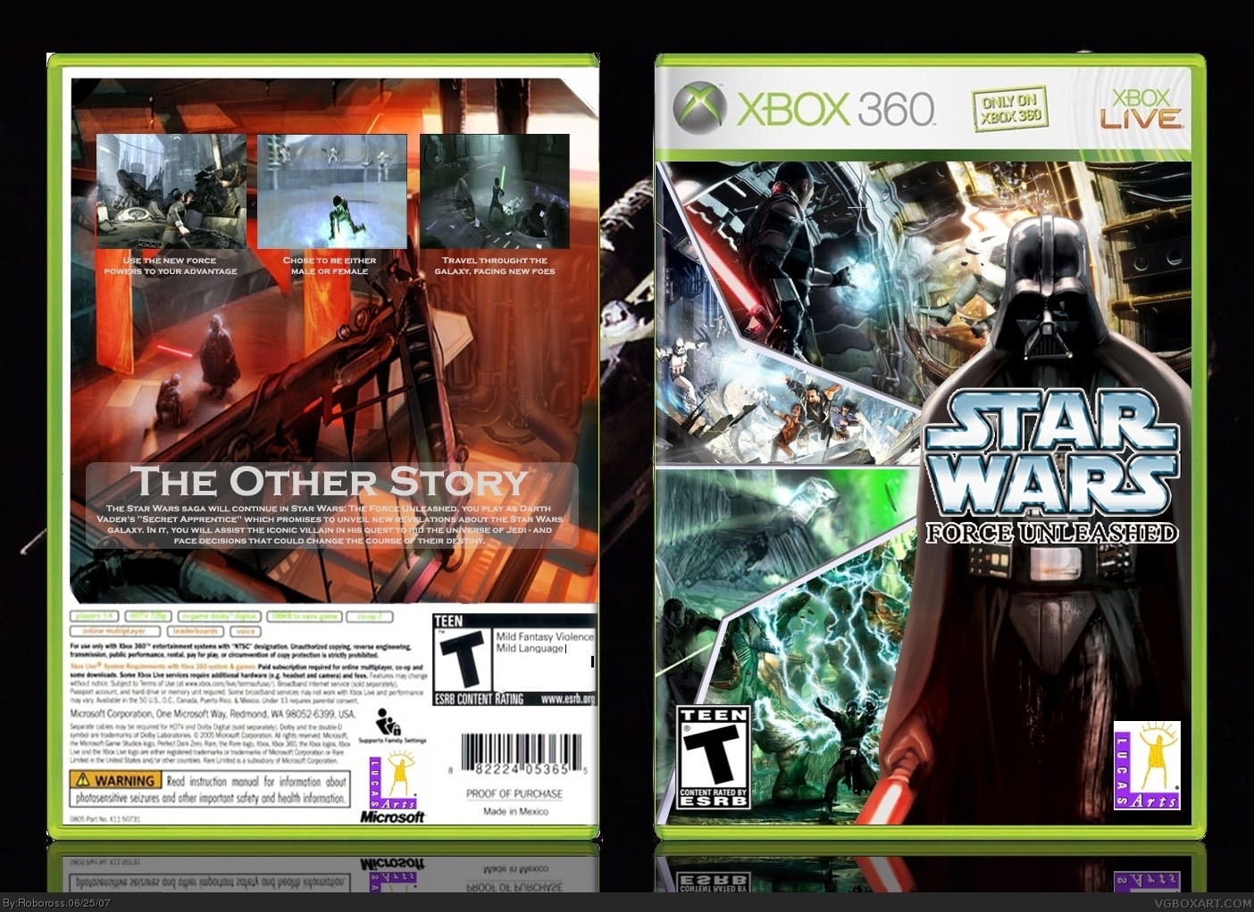
I agree with you about the back, the logo in the front looks blurry and the esrb rating info is touching the temp, but it still remains an good job! (4.25/5)
well, looks nicer certainly, but i suggest cleaning up the box edges, making the canvas background lighter so it doesnt distract from the box itself. the back is still a bit empty, you might also want to use a clearer image for the background.
the front cover could also use a region logo, btw.
 Star Wars: The Force Unleashed Box Cover Comments
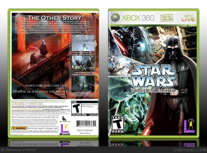
This took me A LONG TIME and probably the best one i've ever done.
i think i might have made it to soon because i couldn't find many screenshots:/
so sorry if the back is a little empty.
Edited at 1 decade ago
[ Reply ]
I agree with you about the back, the logo in the front looks blurry and the esrb rating info is touching the temp, but it still remains an good job! (4.25/5)
Edited at 1 decade ago
[ Reply ]
I like this one. 4/5, your best work.
[ Reply ]
#2, yeah im going to go to sleep and then try to fill the back in with more stuff.
Rate and stuff please?
[ Reply ]
Everything is great, but the back is a little empty 4/5
[ Reply ]
needs a little bit of fixing but its amazing, ross you better than me now =[
[ Reply ]
about the front, i like the combination of the images but the logo is oddly placed and could use a drop shadow/glow to cover up the rugged edges.
Edited at 1 decade ago
[ Reply ]
#6, Sike
[ Reply ]
i messed up big time.
im going to upload a diffrent box later.
[ Reply ]
need some back art
[ Reply ]
Yep but other than that it looks pretty damn good. Keep it up. 4/5
[ Reply ]
Updated the back and moved the logo around.
and im about to update it again haha, i forgot about the white and stuff around the box
Edited at 1 decade ago
[ Reply ]
well, looks nicer certainly, but i suggest cleaning up the box edges, making the canvas background lighter so it doesnt distract from the box itself. the back is still a bit empty, you might also want to use a clearer image for the background.
the front cover could also use a region logo, btw.
Edited at 1 decade ago
[ Reply ]
Edited at 1 decade ago
[ Reply ]
Alright i worked pretty hard on fixing up the back.
But as i said earlier, due to the lack of materials for this game, It's not as good as i wish it would have been but i'm done updating
[ Reply ]
Haha please rate?
[ Reply ]
Wow, this box is really really good. 5/5
[ Reply ]
Great box, just cut out the LucasArts logo 4.5/5.
[ Reply ]
#18, Alright, i fixed it?
Also i was trying to make not look like any of the other ones, and on that level i think i did good.
Edited at 1 decade ago
[ Reply ]
Rate?
[ Reply ]
I created some monsters lol.
[ Reply ]
#21, ????
[ Reply ]
I luv it 5/5
[ Reply ]
much better then the fist edition 5/5 +fav
[ Reply ]
Thanks
[ Reply ]
Awesome Updated .
[ Reply ]
i am in love with this box. 6/5
Edited at 1 decade ago
[ Reply ]
thanks.
[ Reply ]
Updated the back.
Thanks to TrevOwnz for the constructive criticism.
Enjoy and tell me what you think:D
[ Reply ]
The back cover is now much cooler than the front. I'm really liking the update. :)
[ Reply ]
#30, Thanks
[ Reply ]
I can't wait for this game!!!
4/5
[ Reply ]
It's good, but there's a lot going on...
[ Reply ]
Also, there's some grammatical problems with the reviews on the back.
[ Reply ]
I was thinking for the longest time that i wasn't going to be able to update my force unleashed and now i am almost done!! I cant wait to finish it.
[ Reply ]
Feel free to finish that box, Trev.
[ Reply ]
VeRy Go0D darth not the main charecter so fix that great box though
[ Reply ]
#37, He's banned...
[ Reply ]
the front is good but the back is to plan
[ Reply ]
not the best back and the title logo looks kinda awkward but pretty cool
[ Reply ]