i especially chose not to use screenshots, because i thought it'd be weird..
there are not alot of mmorpg boxes with screenshots.. that i like xD
thanks anyways
ok i know you were trying to use the 3d temp from the star, but because of that the images are well not in the same dimension of the box.... Thats why i only do 2d boxes...
I disagree; Lotro has great graphics and should be highlighted on the back. In addition, the font, while evil, is too hard to read to be anything other than decoration. There are a lot of other considerations to be made too, which you may or may not be worried about, such as the humongous blocks of legal, system requirements, publisher logo, games for windows block and some actual descriptive text.
I'm a fan of the ring and ring script on the front, though, and this is nitpicky, the lotro logo shown is the older version (note the many swoops and swirls on the one you used, compared to the one at the official website.
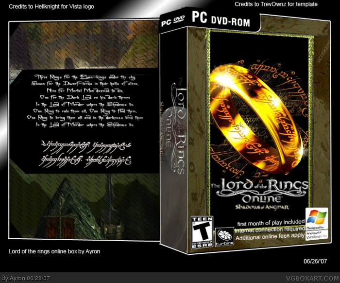
 The Lord of the Rings Online: Shadows of Angmar Box Cover Comments
My lord of the Rings online box.
this one took me ALOT of work!..
comments are appreciated. ;)
[ Reply ]
Looks good but need some screenshots on the back I think.
[ Reply ]
i especially chose not to use screenshots, because i thought it'd be weird..
there are not alot of mmorpg boxes with screenshots.. that i like xD
thanks anyways
[ Reply ]
#3, It was just a suggestion ^^
[ Reply ]
Damn i was going to make a box just like this once i finished the one im working on now. haha.
[ Reply ]
ok i know you were trying to use the 3d temp from the star, but because of that the images are well not in the same dimension of the box.... Thats why i only do 2d boxes...
[ Reply ]
well, they are in the same dimensions..only the turbine logo might be skewed right corner up a notch.
[ Reply ]
you might wanna consider reducing the size of the text next to the vista logo. great box!
[ Reply ]
don't like the pattern on the back..
[ Reply ]
whats with the stripey pattern and Buffy font?
[ Reply ]
=.='
it's .. evil!xD
[ Reply ]
I disagree; Lotro has great graphics and should be highlighted on the back. In addition, the font, while evil, is too hard to read to be anything other than decoration. There are a lot of other considerations to be made too, which you may or may not be worried about, such as the humongous blocks of legal, system requirements, publisher logo, games for windows block and some actual descriptive text.
I'm a fan of the ring and ring script on the front, though, and this is nitpicky, the lotro logo shown is the older version (note the many swoops and swirls on the one you used, compared to the one at the official website.
[ Reply ]