Well I wanted just slight glimpses of different colour(s) to highlight some of the characters/objects.
I can understand why you'd say blue since the screenshots at the back are mostly blue, but really every Starcraft II screenshot released to date has an excess of blue. I actually wanted to downplay the blue to quite an extent, thats why I even desaturated the modified logo - because I had to use the blue-ish screenshots. ;)
I have looked at your page at least 20 times and have never seen this box. Never. It's like a hidden treasure, waiting to reveal itself to me at the moment at the very moment it deems me worthy of taking in its greatness.
#20, I totally agree! I looked at how many boxes that dms didn't get in the hall, and I saw two. So I decided to check em out. But you're right, this sure looks like hidden treasure to me :)
 StarCraft II Box Cover Comments
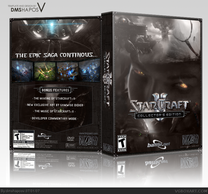
Did a lot of effort on multiple fronts. Tried to make it as different and original as possible. Crits, comments and +fav are all welcome. enjoy!
[ Reply ]
looks tight just needs a little more color.
[ Reply ]
you, my sir, win. This is great stuff.
[ Reply ]
Darn good, I'd say. And you posted it after I posted my Hairspray. Dork.
[ Reply ]
Try adding a rounded black stroke around the box to make it look moe realistic but this is truly amazing
[ Reply ]
well i like it, i like the vibe of it, yup!
[ Reply ]
#2, I gave it the wartorn "brown" feel on purpose. ;)
#5, Most traditional PC boxes are hard-edged, so I kept it that way. :)
Edited at 1 decade ago
[ Reply ]
nice one dude!!
[ Reply ]
I like it. Maybe just some blue color on the front somewere. Cos it's a bit too gray.
[ Reply ]
Well I wanted just slight glimpses of different colour(s) to highlight some of the characters/objects.
I can understand why you'd say blue since the screenshots at the back are mostly blue, but really every Starcraft II screenshot released to date has an excess of blue. I actually wanted to downplay the blue to quite an extent, thats why I even desaturated the modified logo - because I had to use the blue-ish screenshots. ;)
[ Reply ]
this is awesome.
btw, what is your name supposed to be/mean? seems like gibberish to me.
[ Reply ]
#11, I really don't know what my name means :P
I made it up for my email, and have stuck to it since. Most people ask me what it means, but I just let them ponder on it's mysterious nature.
I agree, tis a very generic name :P
[ Reply ]
#12, IF you could pronounce it... it would sound like a russian DJ, i supppose.
[ Reply ]
#13, yea probably it would. Although I treat "V" as 5 in roman numeral not "vee". As in, "DMS Hapos the fifth".
Don't ask why. :P
[ Reply ]
#14, oh that makes some sense...
DMS could be initials. or an organization.
i dunno wutta hell Hapos is but thats cool...
whatever it means... i official dub you "russian DJ" kthnx.
Edited at 1 decade ago
[ Reply ]
This is awesome 5/5 . Nice job !
[ Reply ]
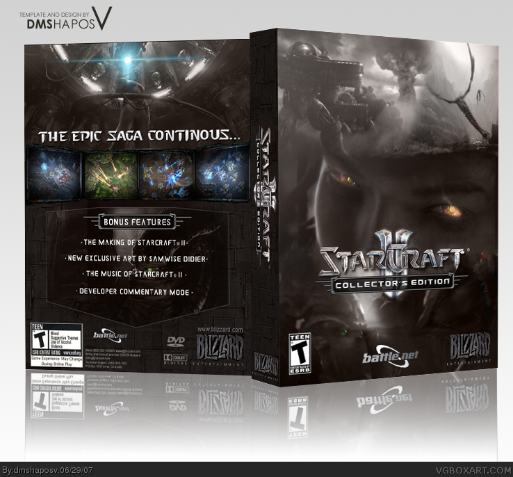
Update: minor tweaks and quality of back improved. :)
[ Reply ]
Nice update, I really like the border. Excellent box overall.
[ Reply ]
dude this box kick ass 5/5
[ Reply ]
I have looked at your page at least 20 times and have never seen this box. Never. It's like a hidden treasure, waiting to reveal itself to me at the moment at the very moment it deems me worthy of taking in its greatness.
[ Reply ]
#20, I totally agree! I looked at how many boxes that dms didn't get in the hall, and I saw two. So I decided to check em out. But you're right, this sure looks like hidden treasure to me :)
[ Reply ]
Yeah, this definitely deserves more attention. '____'
[ Reply ]
#22, yup
[ Reply ]
Heyyyyy, looks like it's going in the Hall! ^_^
[ Reply ]
Yay! Grats on the HoF...again! ^^
[ Reply ]
#25, "Hell... it's ABOUT time."
[ Reply ]
Congratulations, dms.
[ Reply ]
ha ha ha ha
you mispelled continues
[ Reply ]
Nice
[ Reply ]