Its nice but basically you've done the same thing as 100 other people have in past GTA boxes, only this time you were lucky as there was more GTA artwork available and the previos users had to use screenshots/renders.
People try something different with GTA boxes, now. :)

 Grand Theft Auto IV Box Cover Comments
Ihope you guys like it! :)
[ Reply ]
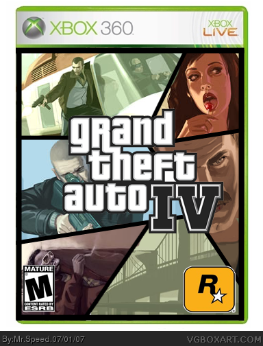
really nice.
only Rockstar logo is too big.
Edited at 1 decade ago
[ Reply ]
Really? On all the official GTA boxarts the Rockstar logo is huge. So I did it like that...
Edited at 1 decade ago
[ Reply ]
well, i guess it could be, but it's bigger than esrb logo, and as far as i know, that should never be the case.
[ Reply ]
#3, Yeah but it isn't that big! Other than that this box is nice. 4/5
[ Reply ]
Your Rocktars logo is really big.
link
The art and desing are perfect.
4.7/5
Edited at 1 decade ago
[ Reply ]
Yes, bottom logos are too big, but the design looks perfect.
Very good job 4.5/5
[ Reply ]
my faveorite GTA 4 box until now.
just get the rockstar logo smaller
Edited at 1 decade ago
[ Reply ]
There ya' go guys, I made the RockStar Games logo smaller. So, what's everyone think of the box now? :D
[ Reply ]
I like it 4.5/5
[ Reply ]
#9, thats better.
[ Reply ]
Yeah the Rockstar logo on the 2nd Version looks better than the one on the 1st Version.
I Like. 4.95/5
[ Reply ]
Great job,, the best GTA IV box on the site I think.
[ Reply ]
Its nice but basically you've done the same thing as 100 other people have in past GTA boxes, only this time you were lucky as there was more GTA artwork available and the previos users had to use screenshots/renders.
People try something different with GTA boxes, now. :)
Edited at 1 decade ago
[ Reply ]
if i saw it in the store, i would think it was the game. good job, just need to shrink the Rockstar logo
Edited at 1 decade ago
[ Reply ]
Thanks guys!
[ Reply ]