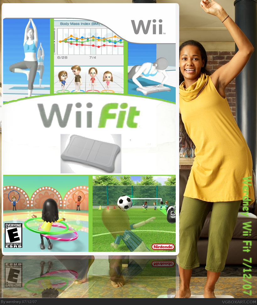
The only difference between V1 and 2 is the background. I couldn't decide. :P
Anyway, I decide to go ahead and submit this without critiques, that forum moves reeeeaaaaal slow. I tried to emulate the past Wii ____ boxes style. Enjoy. (^_^)b
EDIT: wow #1, that was fast...yeah, the feet under the box is because the image was of a guy sitting on a couch while that girl played the game.
#3, I guess I understand, but the screens took awhile to size right, and the bar in the middle took a bit too. And really, when you look at the Wii Play and Wii Sports boxes, that's all the are, and I tried to make my box official looking. But I guess I will take out the board.
Well, the only logo I could get was from a screencap of a video, so I'll try to find a hi-def one, but I'm not gonna have much luck. Which line is choppy though? The curved one? Cause the other ones look fine to me.
I just pulled this logo from the Nintendo Press Room for you: link
Enjoy.
And yes, the curvy line is choppy. The design is cool, though.
I feel the Wii Balance Board pic is out of place... I would suggest either rendering the board, putting at the top in a "Wii Balance Board Included!" type way, or just simply removing it...
And instead of drawing the lines yourself, if that's what your doing, I suggest you just take the Wii Play / Wii Sports box and colorize it, then add the screenshots.

 Wii Fit Box Cover Comments
very cool
Edited at 1 decade ago
[ Reply ]
The only difference between V1 and 2 is the background. I couldn't decide. :P
Anyway, I decide to go ahead and submit this without critiques, that forum moves reeeeaaaaal slow. I tried to emulate the past Wii ____ boxes style. Enjoy. (^_^)b
EDIT: wow #1, that was fast...yeah, the feet under the box is because the image was of a guy sitting on a couch while that girl played the game.
Edited at 1 decade ago
[ Reply ]
It really feels like you posted some screenshots on the Wii template. However, at least its clean and follows the style of other wii sports like boxes
I also feel you should just focus on the boxart - no need for the actual shot of the wiifit board.
Edit: Good thing you changed from V1 to v2.
Edited at 1 decade ago
[ Reply ]
#3, I guess I understand, but the screens took awhile to size right, and the bar in the middle took a bit too. And really, when you look at the Wii Play and Wii Sports boxes, that's all the are, and I tried to make my box official looking. But I guess I will take out the board.
[ Reply ]
Good design, but its not all that good due to the blurry logo and the choppy lines. 3/5.
[ Reply ]
Well, the only logo I could get was from a screencap of a video, so I'll try to find a hi-def one, but I'm not gonna have much luck. Which line is choppy though? The curved one? Cause the other ones look fine to me.
[ Reply ]
i think the white background kinda blends into the template and makes the box look weird. maybe change it to black so the box stands out more.
[ Reply ]
Is this better, plain and simple?
[ Reply ]
I just pulled this logo from the Nintendo Press Room for you: link
Enjoy.
And yes, the curvy line is choppy. The design is cool, though.
I feel the Wii Balance Board pic is out of place... I would suggest either rendering the board, putting at the top in a "Wii Balance Board Included!" type way, or just simply removing it...
And instead of drawing the lines yourself, if that's what your doing, I suggest you just take the Wii Play / Wii Sports box and colorize it, then add the screenshots.
[ Reply ]
Send me the temp
[ Reply ]
How much does it cost? :P 5/5
WII FTW!!!
[ Reply ]