The logo is bad. The reason why its ditter is because he probably uses paint. Nintendo logo is cut out bad. And Ervo, its no use. You can be his teacher and give him some advice, but he'll never use it. If you actually listen to peoples advice, Ranmakuu, you could possibly get better.
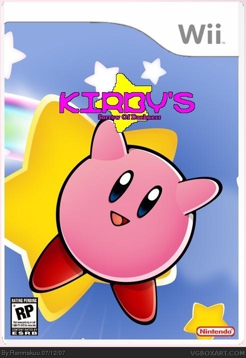
Sorrow of Darkness? Kirby looks too happy! Personally, I think that if you have a dreary(?) name you should have a dreaery(?) background. Just a thought. Otherwords, except for the logo, I like it.

 Kirby's Sorrow Of Darkness Box Cover Comments
It's Kirby on the Nintendo Wii. The current working title for the Wii only game so what do you think?
[ Reply ]
Art: great
Logo: bad
Also, use an E10 or E logo instead of RP. If I have time, I'll try to make a logo for you.
[ Reply ]
Updated
Replaced The RP rating with a E logo So Now what do you think.
P.S. It's more ditter than Verison one but just don't worry about it okay.
Edited at 1 decade ago
[ Reply ]
This aint good. Reasons:
-Logo is bad
-This is ditter, like you said
-Nintendo logo is bad
-Logo should be a little lower
Try to improve it, please?
[ Reply ]
The logo is bad. The reason why its ditter is because he probably uses paint. Nintendo logo is cut out bad. And Ervo, its no use. You can be his teacher and give him some advice, but he'll never use it. If you actually listen to peoples advice, Ranmakuu, you could possibly get better.
[ Reply ]
Sorrow of Darkness? Kirby looks too happy! Personally, I think that if you have a dreary(?) name you should have a dreaery(?) background. Just a thought. Otherwords, except for the logo, I like it.
[ Reply ]
it's pretty bad, but the effort was effortless :)
PLEASE PLEASE PLEASE go check mines out and comment please and thank you :)
[ Reply ]