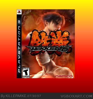
#2, WTF I Cannot agree ! Old namco logo (that is baad cutten out) , Tekken 6 Logo cutten out bad with red balls in it ?!
ESRB too much in the corner,too.
EDIT : Blurry Pic,too.
2.5/5
Jin and Kazuya are way too fuzzy. The teen rating is too close to the edge. It isn't Namco anymore. It's Bandai Namco now. The background is too distracting. Try finding a bit more basic one. If you could, try looking for a better template. 3/5
 Tekken 6 Box Cover Comments
YA like?
[ Reply ]
cool but, lower kazuya or make the tekken logo smaller so we can se all of him, but overall its really good, 4.8/5
[ Reply ]
#2, WTF I Cannot agree ! Old namco logo (that is baad cutten out) , Tekken 6 Logo cutten out bad with red balls in it ?!
ESRB too much in the corner,too.
EDIT : Blurry Pic,too.
2.5/5
Edited at 1 decade ago
[ Reply ]
#3, thats a little harsh and the tekken logo looks the same as it did on your box
Edited at 1 decade ago
[ Reply ]
WTF ? Look : His Looks like Maked bigger in Paint AND : This cannot be my : At my U can see the ''TM'' , at his there's a black thing -.-
[ Reply ]
#5, I suggest that you make an effort to post properly and coherently.
[ Reply ]
Erm -.- : His logo is maked Bigger with PAINT and the TM is Complete black [/EndOfText.]
[ Reply ]
KILLERMIKE, your problem is that your backgrounds are bigger than your boxes, which is NOT a good thing.
But the box looks kick-ass by the way. ;)
[ Reply ]
Jin and Kazuya are way too fuzzy. The teen rating is too close to the edge. It isn't Namco anymore. It's Bandai Namco now. The background is too distracting. Try finding a bit more basic one. If you could, try looking for a better template. 3/5
[ Reply ]
I like the design. "Two sides...one war..." Very very authentic.
[ Reply ]