#1, not really.
the capcom logo is nice, but i prefer the original.
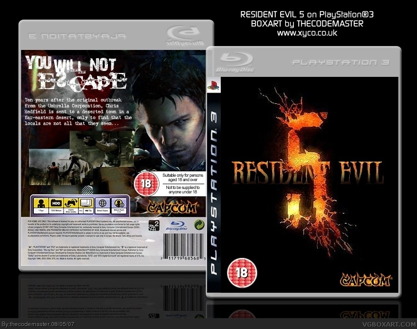
the '5' is overlapping the resident evil.
and back screens have no border + Font isn't really good for this box imo.
so
3/5
#3, I like this Capcom logo, i feel like the Blue and Yellow of the original logo would ruin the cover - it would add too much colour and take away the effect of the "lava" effect.
The "5" is supposed to be overlapping the Resident Evil, but I will see if I can edit the cover to make it slightly more effective.
The back screens have no border because I didn't think they really needed one - but I may add a drop shadow, outer glow in black, or 1px stroke and see if it makes them stand out a little more.
Which font is wrong? I've used several.
The fire effect on capcom is cool. Maybe if you added some more "african" tones in the front while keeping the horror look then this will be all sorts of awesome. :)

 Resident Evil 5 Box Cover Comments
5/5 awesome hall of famer dude
[ Reply ]
Haha, I'd hazard a guess and say this is marginally better than my previous Resi5 box! link
^^ That was like, my 2nd box! ^^
EDIT: #1, hah, it'd be my first hall of famer if it did become one....
Edited at 1 decade ago
[ Reply ]
#1, not really.
the capcom logo is nice, but i prefer the original.
the '5' is overlapping the resident evil.
and back screens have no border + Font isn't really good for this box imo.
so
3/5
[ Reply ]
#3, I like this Capcom logo, i feel like the Blue and Yellow of the original logo would ruin the cover - it would add too much colour and take away the effect of the "lava" effect.
The "5" is supposed to be overlapping the Resident Evil, but I will see if I can edit the cover to make it slightly more effective.
The back screens have no border because I didn't think they really needed one - but I may add a drop shadow, outer glow in black, or 1px stroke and see if it makes them stand out a little more.
Which font is wrong? I've used several.
[ Reply ]
I like this, even though its simple.
The fire effect on capcom is cool. Maybe if you added some more "african" tones in the front while keeping the horror look then this will be all sorts of awesome. :)
[ Reply ]
The resident evil words look like Mortal Kombat words but its still kewl
[ Reply ]
Like the flaming Capcom.
[ Reply ]