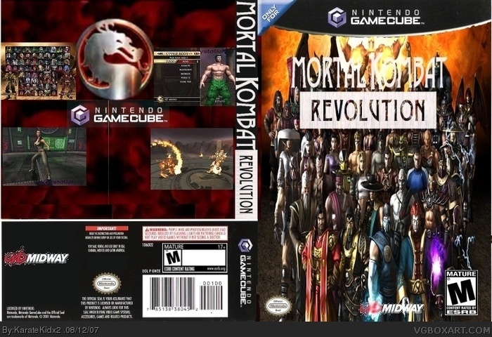
#2, atleast try to give a reason...#3 here it goes: either change the placement or put an outerglow on the logo to make it more readable. Game description on the back would be good and it would be wise to get rid of the gamecube logo on the back. Midway logo cutting can be better and dev & esrb logo is switched. Try to fix those and this box should be much better ;)
 Mortal Kombat: Revolution Box Cover Comments
Thanks to (i think) CMT for logo.
[ Reply ]
its just.....not good
1/5
[ Reply ]
#2, Reason? I need CC if you want me to be better.
[ Reply ]
#2, atleast try to give a reason...#3 here it goes: either change the placement or put an outerglow on the logo to make it more readable. Game description on the back would be good and it would be wise to get rid of the gamecube logo on the back. Midway logo cutting can be better and dev & esrb logo is switched. Try to fix those and this box should be much better ;)
Edited at 1 decade ago
[ Reply ]
#3 ok its not good because the pics are to squished and things are very choppy and blurry. it could be improved alot. nice try though
[ Reply ]
its too squished. on the back you should add some text.its a good start though
[ Reply ]
#4, OK. The dev and ESRB are actually at the right spots.
#5, OK.
#6, it's not my start.
[ Reply ]
#7, my b, you're right about that one
[ Reply ]