to plain. Its way over used and you never ever put any freaking effort in your boxes and its annoying. Please try next time. If you saw this box and it wasn't yours what would you say to it.
#3, I would probably say 'This is a nicely fit "BASIC" box.
Let me tell you this, im not saying ive put days of effort into my boxes, but since my Call of Duty 4, modern warfare for PSX, I have been putting tons more effort into my boxes.
 BioShock Box Cover Comments
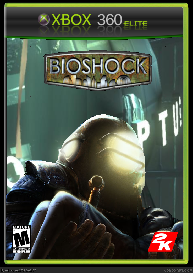
BioShock for xBox 360 'Elite'. I just thought this Elite template provided by Mehdi5 was pretty cool, so credit to him.
Took me a long time somehow, so please rate!
[ Reply ]
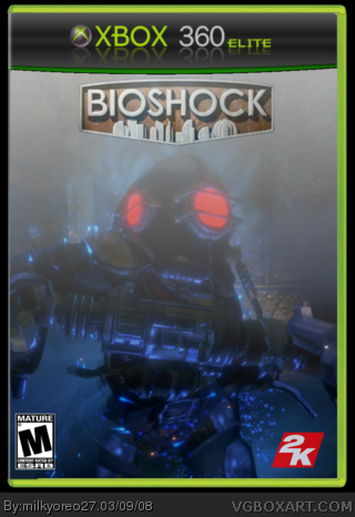
The Rosie seems out of place with the background. 2/5
[ Reply ]
to plain. Its way over used and you never ever put any freaking effort in your boxes and its annoying. Please try next time. If you saw this box and it wasn't yours what would you say to it.
[ Reply ]
#3, I would probably say 'This is a nicely fit "BASIC" box.
Let me tell you this, im not saying ive put days of effort into my boxes, but since my Call of Duty 4, modern warfare for PSX, I have been putting tons more effort into my boxes.
Ill try harder next time ;)
thanks everyone
[ Reply ]
poorly done.
[ Reply ]
boring
[ Reply ]
credit to mehdi5 for the template
[ Reply ]
um its kinda to blurry and blend 2.5/5
[ Reply ]