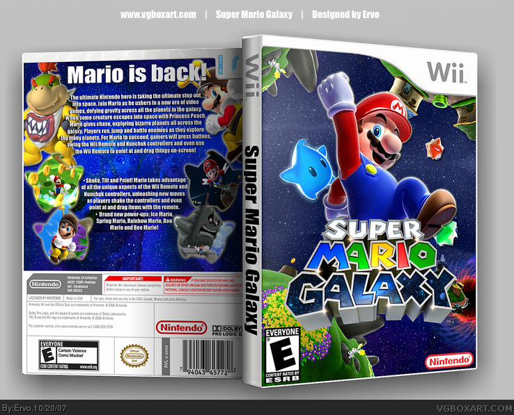
verynice, but i don't like this font you keep using. it's very chunky and doesn't look very nice on a mario box, and it kills the spine for me. also, i'd tone down the shadow on imandix. look at my boxes, for example. I rarely use the shadow because it looks bad. also, your E logo on the front is too large and too close to the edge.
 Super Mario Galaxy Box Cover Comments
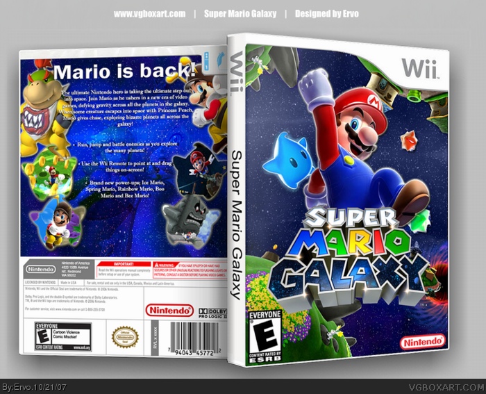
Hope ya like it even if it's just another MArio Galaxy box :P
E: Thanks guys, you are fast ;D
Edited at 1 decade ago
[ Reply ]
Magnificent 10/10 fave
[ Reply ]
wow the front looks amazing the back has to much text and plain looking though
Still, fave
[ Reply ]
verynice, but i don't like this font you keep using. it's very chunky and doesn't look very nice on a mario box, and it kills the spine for me. also, i'd tone down the shadow on imandix. look at my boxes, for example. I rarely use the shadow because it looks bad. also, your E logo on the front is too large and too close to the edge.
[ Reply ]
i like the front alot, actually. but the back has too much text and boring organization.
[ Reply ]
#4, so what should i do with the spine? I'll try to fix some of those things tomorrow :)
ff22, thanks for the fast reply, i'll remove some of the text tomorrow!
Edited at 1 decade ago
[ Reply ]
Really really nice.
[ Reply ]
#6, change the font to arial and make the text size smaller. Look at an official box.
[ Reply ]
UPDATED! Looks better now i guess.
[ Reply ]
Looks clean. Great job.
[ Reply ]
pretty cool 5/5
[ Reply ]