Wow, this art has been out for 1 day and it's already getting old... good box but I don't think the screenshot borders really suit the style of the game. 4.5/5
technically impressive. some minor flaws still abound though: m logo is a bit big, game info layout on the back looks weird and takes up too much space. consider lowering the game info down by eliminating the small amount of text in between the player info and the last paragraph. thus lowering the screenshots and text elements and producing a better and more organized look, ersb on back is a bit small as well. Design wise, detail separates the amazing boxes from the great boxes. My only complaint that bothered me is that the background doesn't compliment the box at all, maybe the temp, but not the box. I suggest I golden-ish to green gradient background along with the bg texture to really bring out the full potential of this box. design is great, but that part is the weakness of this box. I myself spend much time looking for a good complimentary bg on my boxes, consider doing the same for yours. overall great job and keep it up man.
P.S. can you tell me the what/where I can find the font you use on the back and for your sig? tnx
It makes me depressed that my Assassin's Creed box never gets comments :( (Hey, I worked hard on it...I'll shameless plug if I want :P)
Oh. As for this box, this is like....daaaamn. It's refreshing to see a new color scheme. The design is overall flawless though I am not fond of the logo placement. Regardless - kickass box.
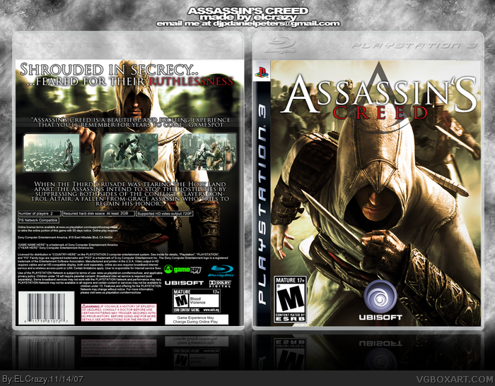
I'm not sure whether I like the different colour scheme or not, although your effort did pay off mostly. The logo seems a bit too big on the front, or in a bad place =/
#10, too bad you count on reviews to tell you how games are! unless a game gets like a million downright horrid reviews, you count on what you think of the game, not what stuck-up reviewers thing.
#5, the font on the back here is Trojan Pro and is found in the Assassin's Creed fansite kit.
 Assassin's Creed Box Cover Comments
Don't ask, just don't.
Decided to do a different colour theme, because the blue theme is overused.
I spent a great amount of time editing the pics.
Edited at 1 decade ago
[ Reply ]
This is awesome! 5/5
[ Reply ]
This is the greatest you made.
[ Reply ]
Wow, this art has been out for 1 day and it's already getting old... good box but I don't think the screenshot borders really suit the style of the game. 4.5/5
[ Reply ]
technically impressive. some minor flaws still abound though: m logo is a bit big, game info layout on the back looks weird and takes up too much space. consider lowering the game info down by eliminating the small amount of text in between the player info and the last paragraph. thus lowering the screenshots and text elements and producing a better and more organized look, ersb on back is a bit small as well. Design wise, detail separates the amazing boxes from the great boxes. My only complaint that bothered me is that the background doesn't compliment the box at all, maybe the temp, but not the box. I suggest I golden-ish to green gradient background along with the bg texture to really bring out the full potential of this box. design is great, but that part is the weakness of this box. I myself spend much time looking for a good complimentary bg on my boxes, consider doing the same for yours. overall great job and keep it up man.
P.S. can you tell me the what/where I can find the font you use on the back and for your sig? tnx
[ Reply ]
Looks great
[ Reply ]
It makes me depressed that my Assassin's Creed box never gets comments :( (Hey, I worked hard on it...I'll shameless plug if I want :P)
Oh. As for this box, this is like....daaaamn. It's refreshing to see a new color scheme. The design is overall flawless though I am not fond of the logo placement. Regardless - kickass box.
[ Reply ]
i like the front alot and i'm glad to see a new color scheme because practically all the other boxes are blue-ish
[ Reply ]
I'm not sure whether I like the different colour scheme or not, although your effort did pay off mostly. The logo seems a bit too big on the front, or in a bad place =/
[ Reply ]
TOO BAD THIS GAME SUCKS! AHAHAHAHAHAHAhahaahhhh...
<___<
>___>
[ Reply ]
#10, I thought it got awesome reviews?
To the rest, thanks a lot. Ladykiller, I'll keep those suggestions in mind, thanks! :)
[ Reply ]
#10, too bad you count on reviews to tell you how games are! unless a game gets like a million downright horrid reviews, you count on what you think of the game, not what stuck-up reviewers thing.
#5, the font on the back here is Trojan Pro and is found in the Assassin's Creed fansite kit.
[ Reply ]
I was ecxpecting to see around 15 favs today. This is pretty bizarre.
[ Reply ]
#12, I know, I was being facetious.
[ Reply ]
Noice
[ Reply ]
pwnz mine x10021223
faved.
[ Reply ]
12, I love that font with a passion...I always use it.
[ Reply ]
#17, Yep I've been noticing that xD
It fitted perfectly in your Airborne box.
[ Reply ]
where the fuck is this art coming from!!!!!!?!?????
[ Reply ]
Well, when mommy art loves daddy art...
*makes intercourse motions with fingers*
[ Reply ]
#19, Me not telling. ;)
#20, LOL.
[ Reply ]
#21, ahhhhhhhh!!!!!!!!!!!!!!!!!!!!!!!!!!!!!!!!!!!!!!!!!!!!!!!!!!!!!!!!!!!!!!!!!!!!!!!!!!!!!!!!!!!!!!!!!!!!!!!!!!!!!!!!!!!!!!!!!!!!!!!!!!!!!!!!!!!!!!!!!!!!!!!!!!!!!!!!!!!!!!!!!!!!!!!!!!!!!!!!!!!!!!!!!!!!!!!!!!!!!!!!!!!!!!!!!!!!!!!!!!!!!!!!!!!!!!!!!!!!!!!!!!!!!!!!!!!!!!!!!!!!!!!!!!!!!!!!!!!!!!!!!!!!!!!!!!!!!!!!!!!!!!!!!!!!!!!!!!!!!!!!!!!!!!!!!!!!!!!!!!!!!!!!!!!!!!!!!!!!!!!!!!!!!!!!!!!!!!!!!!!!!!!!!!!!!!!!!!!!!!!!!!!!!!!!!!!!!!!!!!!!!!!!!!!!!!!!!!!!!!!!!!!!!!!!!!!!!!!!!!!!!!!!!!!!!!!!!!!!!!!!!!!!!!!!!!!!!!!!!!!!!!!!!!!!!!!!!!!!!!!!!!!!!!!!!!!!!!!!!!!!!!!!!!!!!!!!!!!!!!!!!!!!!!!!!!!!!!!!!!!!!!!!!!!!!!!!!!!!!!!!!!!!!!!!!!!!!!!!!!!!!!!!!!!!!!!!!!!!!!!!!!!!!!!!!!!!!!!!!!!!!!!!!!!!!!!!!!!!!!!!!!!!!!!!!!!
[ Reply ]
#22, Too bad, man. Try finding it yourself.
[ Reply ]
Should have updated your other box i love it.
[ Reply ]
#24, Thanks :)
But if I update, I'd bet no one would comment.
[ Reply ]