ok, i'm sorry, but i don't know why people like this..
here's a few tips:
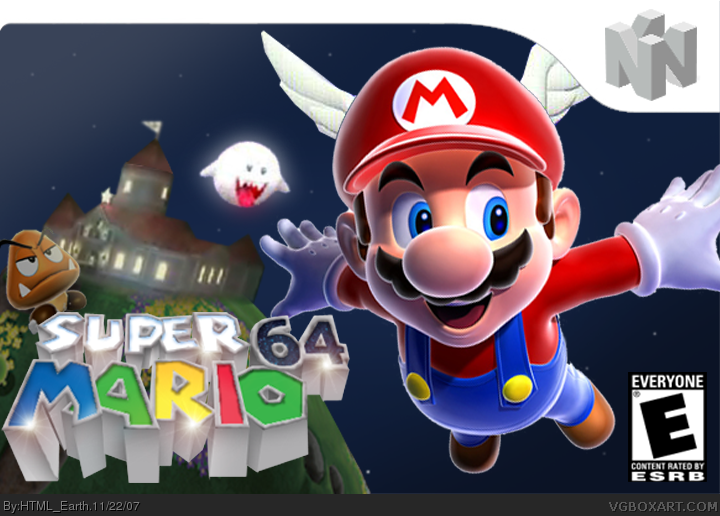
1-the cut on mario's wings is bad. either try fixing it, or making it less obvious.
2-the template is hiddeous. please don't use a old nintendo logo on a stretched wii bar.
3-the logo is oddly placed. same goes for mario.
4- as stated before, the images are of a bad quality, try googling for better ones, don't stop before you found some.
5- last but not least, the ESRB is huge, and some things are randomly placed....

 Super Mario 64 Box Cover Comments
What Super Mario 64 would have looked like with Super Mario Galaxy Graphics
[ Reply ]
Yay! I like it! fave from me!
[ Reply ]
it's great
you have a fav
[ Reply ]
it's good i like it, but Mario's wings is a bit odd. +fav
[ Reply ]
#4, what's odd about them?
[ Reply ]
AWESOME =D 5/5 +FAV
[ Reply ]
i dunno what is happeing with that temp, but it looks great
3.5/5
[ Reply ]
Looks gross to me. The resolution on the images is really bad! Super Mario Galaxy doesn't even have bad graphics like that and the boo is so scratchy.
[ Reply ]
#8, You're talking about the castle and the boo right?
i couldn't find any good screenshots of them, and i don't have a capture card for my computer.
Edited at 1 decade ago
[ Reply ]
ok, i'm sorry, but i don't know why people like this..
here's a few tips:
1-the cut on mario's wings is bad. either try fixing it, or making it less obvious.
2-the template is hiddeous. please don't use a old nintendo logo on a stretched wii bar.
3-the logo is oddly placed. same goes for mario.
4- as stated before, the images are of a bad quality, try googling for better ones, don't stop before you found some.
5- last but not least, the ESRB is huge, and some things are randomly placed....
i hope that helped,
-Ayron
[ Reply ]
#10, i have updated it a bit now, i'll find some new pictures of the castle and the boo later
[ Reply ]
Dude you have a favorite 5/5
[ Reply ]
Verison one looks like a big box that Guitar Hero III: Legends Of Rock have but awesome idea next time would you make it smaller please.
8.2/10
[ Reply ]
minor update of the castle
[ Reply ]
holy crap that's sweet!!!!!!
[ Reply ]
this is great, just make the template red. or what ever the normal color is
Edited at 1 decade ago
[ Reply ]
Amazong...
[ Reply ]