o god I'm not very good at creating box art.I've tried and I've tried but I keep failing all the time.I wll still keep tring all the time.does anyone have any good advice on how I can or whats the best program to use to create good box art.
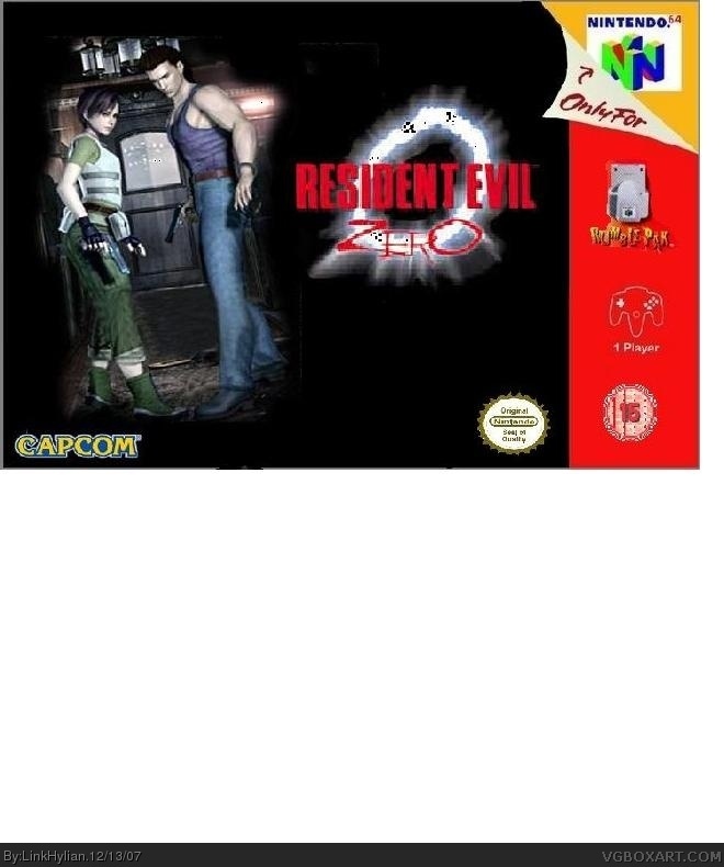
-Get rid of the unneeded white space.
-Get a better Capcom logo.
-Get a better picture.
-Get a bigger template from the VGBA DB.
-Get a better ONS logo.
 Resident Evil Zero Box Cover Comments
omg e.o 2/5
[ Reply ]
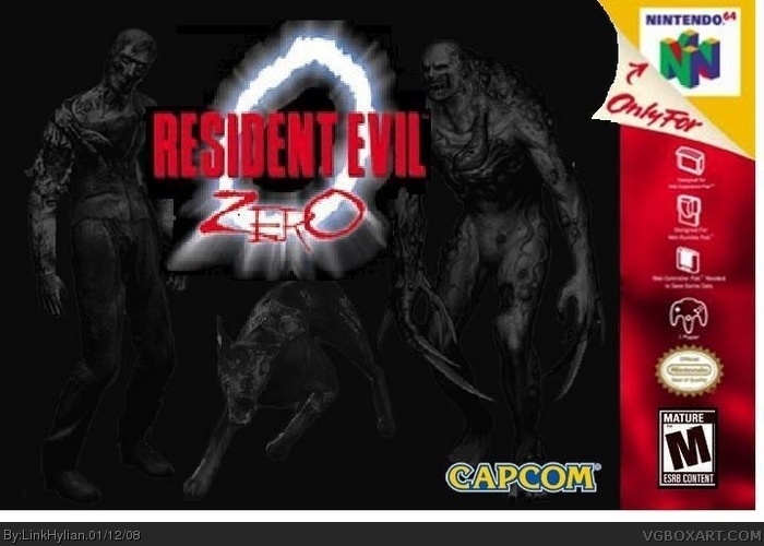
It's awfully plain and blurry.
Suggestions:
Add a background.
Cut the logos out better.
Get a less blurry temp and picture.
2.5/5
[ Reply ]
o god I'm not very good at creating box art.I've tried and I've tried but I keep failing all the time.I wll still keep tring all the time.does anyone have any good advice on how I can or whats the best program to use to create good box art.
Edited at 1 decade ago
[ Reply ]
#1, making non-constructive comments is a no no.
-Get rid of the unneeded white space.
-Get a better Capcom logo.
-Get a better picture.
-Get a bigger template from the VGBA DB.
-Get a better ONS logo.
Not trying to be harsh, but 1/5.
[ Reply ]
dude this is sorta plain but i love the logo did you make that. the box overall 2/5 you can do better if you really try
[ Reply ]