#14, But it looks EXACTLY like what you did on Photofiltre.
I told you, read some tutorials, get some tips before posting it.
THIS is what I mean. You NEVER take advice.
#16, NO ONE?!??
Take a god damn look at your previous boxes, there are a lot of advice you could've taken and improved.
You could've sent PMs to people you knew that could give you advice.
#23, thanks for listening, finally.
just listen to Ervo and ELCrazy, they know what they're talking about.
also, the screens are really unorganised and misplaced. don't try slanted screens unless it somehow fits the game. believe me,i had to find that out as well.xD
#31, 8/10, 16/20, 80% is great !
#32, thanks ;) I didn't put tagline on it because I didn't found what I should've... You know, I don't know what the game is talking about :)
 Frontlines: Fuel of War Box Cover Comments
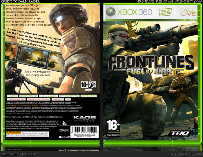
Here my latest box :p Credit to Dark Raider for his temp...
[ Reply ]
I like it but:
The "Fuel of War" text is choppy.
You don't have a rating on the back.
The text at the top is allover the place.
[ Reply ]
#2, 1. I tried to make it looks 3D
2. Yep, forgot, will put one.
3. I didn't understood what you meant... ?
[ Reply ]
ooh, this is great :D 4.4/5
[ Reply ]
#4, thanks ;)
[ Reply ]
#3, the text is unorganized.
Edited at 1 decade ago
[ Reply ]
#6, mmmmmm... yeah... I did mean to
[ Reply ]
I just hope your proposed Zelda box will come soon....
[ Reply ]
Edited at 1 decade ago
[ Reply ]
#9, LOL!
[ Reply ]
#10, What did he say?
[ Reply ]
#11, I said I gave up on Zelda cause it looked too much like my previous three :) I made this.
Edited at 1 decade ago
[ Reply ]
Edited at 1 decade ago
[ Reply ]
#13, I made it on CS2
[ Reply ]
#14, But it looks EXACTLY like what you did on Photofiltre.
I told you, read some tutorials, get some tips before posting it.
THIS is what I mean. You NEVER take advice.
[ Reply ]
#15, like I told you, no one :(
[ Reply ]
#16, NO ONE?!??
Take a god damn look at your previous boxes, there are a lot of advice you could've taken and improved.
You could've sent PMs to people you knew that could give you advice.
*sigh*
[ Reply ]
#13, LOL! Okay I'm sorry. =P
[ Reply ]
I ain't so good :I You should really try to fix the text problem you have with your boxes.
[ Reply ]
#19, yeah, I know. I got no good fonts though... Will download some.
[ Reply ]
nice box, never heard of the game
[ Reply ]
#20, thank you.
[ Reply ]
#22, thanks you ? why ? Are you glad that I'll download fonts ? Or was it a mistake ?
[ Reply ]
#23, thanks for listening, finally.
just listen to Ervo and ELCrazy, they know what they're talking about.
also, the screens are really unorganised and misplaced. don't try slanted screens unless it somehow fits the game. believe me,i had to find that out as well.xD
[ Reply ]
...I think this is just a wallpaper... I could be wrong though...
[ Reply ]
#25, you're wrong. The front is, OK. But the back isn't.
[ Reply ]
This is absolutely gorgeous. Going in my faves. 5/5
[ Reply ]
#27, O_o Are you serious ?!
wow Thanks a lot :D
[ Reply ]
#26, That's what I meant.
[ Reply ]
#29, maybe, what's wrong with it ?
Edited at 1 decade ago
[ Reply ]
i don't think they would put an 8/10 score on a box, they only ever do that if the game gets at least a 9.
[ Reply ]
looks great f1. I highly suggest next time to put some kind of tagline or caption on the back. Otherwise, really nice!
[ Reply ]
#31, 8/10, 16/20, 80% is great !
#32, thanks ;) I didn't put tagline on it because I didn't found what I should've... You know, I don't know what the game is talking about :)
[ Reply ]
cool
[ Reply ]