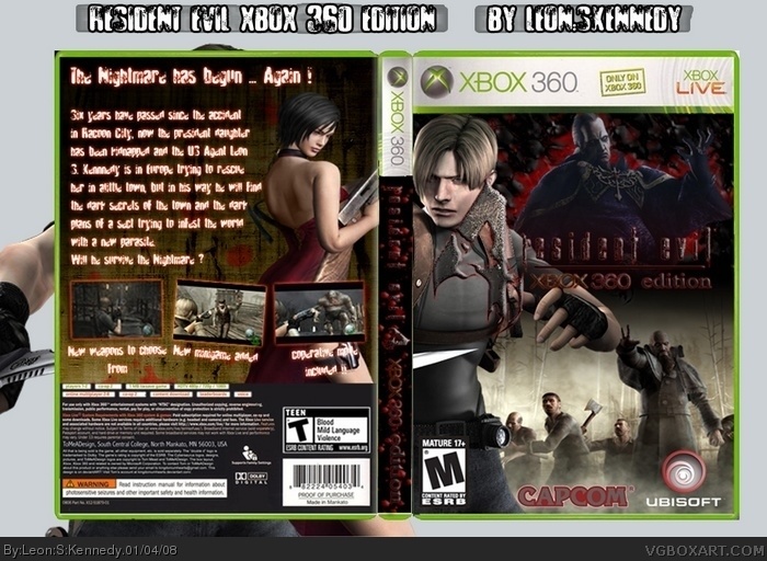
That's an awesome first! I can't really see anything wrong with, but I don't think Ubisoft would publish this. And it's TEEN on the back and MATURE on the front. 4/5 for a first. Fix those things and this will be excellent.
Welcome to VGBoxart. Please don't feed the trolls. Thank you.
Wow, I haven't seen someone's first box been this good in a while. The thing I really don't like is the red on the Capcom and Ubisoft logo. The front is a tiny bit messy and the text on the back isn't too clear but read-able. Other than that a great 1st box , hope you have a nice time. 4/5
I wonder why ttt is not complaining about blurry stuff or bady cut parts... oh well, it is not bad at all but I`d change some stuff.
The title cannot be read that well. Red and black don`t work that well when you are using it as background and text, yaou know? you should put some outlines around the text here or make the background behind the font brighter. Same for the title at the back.
Than you got some widow line (one word in one line) and that`s something you should avoid at any time ("typographic dos and don`ts").
 Resident Evil 4 XBOX 360 Edition Box Cover Comments
My fist boxart !!!
[ Reply ]
That's an awesome first! I can't really see anything wrong with, but I don't think Ubisoft would publish this. And it's TEEN on the back and MATURE on the front. 4/5 for a first. Fix those things and this will be excellent.
Welcome to VGBoxart. Please don't feed the trolls. Thank you.
[ Reply ]
Not bad for a first. And welcome to the site
[ Reply ]
Wow, I haven't seen someone's first box been this good in a while. The thing I really don't like is the red on the Capcom and Ubisoft logo. The front is a tiny bit messy and the text on the back isn't too clear but read-able. Other than that a great 1st box , hope you have a nice time. 4/5
Edited at 1 decade ago
[ Reply ]
#2 Actually, Ubisoft is publishing RE4
Edited at 1 decade ago
[ Reply ]
#5, really? I bet it's gonna rock then.
[ Reply ]
HAHAHAHA THAT'S MY TEMPLATE!
Thanks.
[ Reply ]
#5, they published the PC version, but none of the others.
Edited at 1 decade ago
[ Reply ]
For a first its good. Welcome to the site.
[ Reply ]
#1, you seem familiar are you part of the RE4 PC fourms?
Great first a hell of alot better than my first. 4/5
[ Reply ]
Yes, nice for a first, but I would suggest against using blood/blood color font. It looks bad, mainly against black.
Besides that, welcome!
[ Reply ]
Nice. Reminds me of what an early xIAMHUNTERx would do =P
[ Reply ]
I wonder why ttt is not complaining about blurry stuff or bady cut parts... oh well, it is not bad at all but I`d change some stuff.
The title cannot be read that well. Red and black don`t work that well when you are using it as background and text, yaou know? you should put some outlines around the text here or make the background behind the font brighter. Same for the title at the back.
Than you got some widow line (one word in one line) and that`s something you should avoid at any time ("typographic dos and don`ts").
[ Reply ]