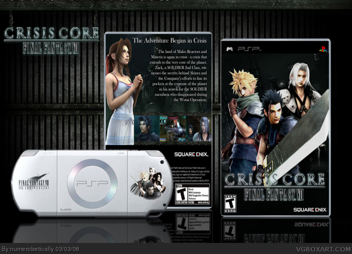
what's bg? i probably know..its just not registering haha. i was thinking about a back, but i wasn't sure whether or not to make it like the front (scalelines) or different
okay, i have a back now and i like this set up, even though the psp is overlapping the back because it isnt blocking the picture. tell me what you think.
 Crisis Core Final Fantasy VII Box Cover Comments
my first box with a console :) i want this game so bad but i dont have a psp
[ Reply ]
VEry nice. But I think the BG needs some more.
Fave just for the console.
Edited at 1 decade ago
[ Reply ]
grreeeaaat (tony the tiger voice*)
My only suggestion is to tone down the scanlines on the front, as well as give the back a shot ;)
[ Reply ]
what's bg? i probably know..its just not registering haha. i was thinking about a back, but i wasn't sure whether or not to make it like the front (scalelines) or different
[ Reply ]
im guessing he means background (bg). i agree with #3, tone down the lines. and also move the Square Enix logo away from the edge slightly.
other than that, looks good.
[ Reply ]
XD i so knew that too. pretty embarassed over here. i'm not blonde, i SWEAR. :( i liked the lines, but alright
[ Reply ]
the lines just seem too dark.
it takes away from the characters. to me, it makes them look a little pixelated (if thats the right word)
[ Reply ]
that word works. anyway, it's updated. you can't really see the lines here, but you can if you view it in full. thanks for your help #7
#9 thanks! and by popular demand, i will make a back. i got some inspiration, you might say.
Edited at 1 decade ago
[ Reply ]
I love the background and the PSP and front. Looks great. Should have made a back also =]
[ Reply ]
#8 - no problem. thats what im here for. literally, im done boxes for a while soo ill be trying to help people out.
looks better.
[ Reply ]
like the box, the system not so much. I would add a different picture to the back. still good 10/10
Edited at 1 decade ago
[ Reply ]
i think you should've used the total background[ behind the box ] as a background IN the box.
REally nice though.
[ Reply ]
the psp design is better than the box, but overall it's a very smooth, simple box. 4/5
Edited at 1 decade ago
[ Reply ]
Love it babe. Its hot!!
[ Reply ]
#12 do you? that's really interesting. i think i may do that for the back :)
[ Reply ]
okay, i have a back now and i like this set up, even though the psp is overlapping the back because it isnt blocking the picture. tell me what you think.
[ Reply ]
*nods head*
this is excellent. well done.
[ Reply ]
I like gray dark colors in this one :)
+ Fav
[ Reply ]
damn, i missed this, great job. fav+
[ Reply ]
Just Perfect !
[ Reply ]