do NOT SKIP A MILLION LINES JUST TO SAY YOU ARE KIDDING!
#5 i dont think you should have used so much contrast for the characters on the front. tone it down a bit.
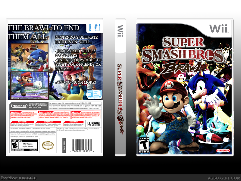
on the back you should say "is" instead of "with" because when you put the information together it becomes "Nintendo's Ultimate Fight Is On With Jam-packed with 35 characters" (spelled wrong). if you still want to use "with" i suggest changing the bottom info to "35 of your favorite nintendo characters" and "online compatible" to "online compatibility"(where enemies is spelled wrong). i think the nintendo logo is a bit small but i probably only noticed since im nitpicking trying to help you :). the biggest problem, i think, is that the ratings don't match (e on the back, t on the front) pick one or the other XD - and i do realize the esrb rating was there when you got the template, so it's just a case of overlooking details.
overall, i like it. fix those things, and other people will really like it too :)

 Super Smash Bros. Brawl Box Cover Comments
brawl comes out in 5 days i cant wait! =D i never did a brawl box so here it is =D
Edited at 1 decade ago
[ Reply ]
#1, just got delayed till april 30th
just kidding!
Nice box btw. the front is cool but the back is meh.
Edited at 1 decade ago
[ Reply ]
thanks =] i know the back sucks =[
[ Reply ]
The colors look washed out on the front...
And what is up with the spelling on the front?
Edited at 1 decade ago
[ Reply ]
#4, i think you mean the logo?
[ Reply ]
do NOT SKIP A MILLION LINES JUST TO SAY YOU ARE KIDDING!
#5 i dont think you should have used so much contrast for the characters on the front. tone it down a bit.
on the back you should say "is" instead of "with" because when you put the information together it becomes "Nintendo's Ultimate Fight Is On With Jam-packed with 35 characters" (spelled wrong). if you still want to use "with" i suggest changing the bottom info to "35 of your favorite nintendo characters" and "online compatible" to "online compatibility"(where enemies is spelled wrong). i think the nintendo logo is a bit small but i probably only noticed since im nitpicking trying to help you :). the biggest problem, i think, is that the ratings don't match (e on the back, t on the front) pick one or the other XD - and i do realize the esrb rating was there when you got the template, so it's just a case of overlooking details.
overall, i like it. fix those things, and other people will really like it too :)
Edited at 1 decade ago
[ Reply ]
yeah this is pretty nice. the back has some grammar problems, and nintendo logo's too small on front, but i like it. 4/5
[ Reply ]
k i took away the ugly back and added a reflection
[ Reply ]