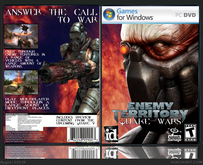
the reflection is just as bad as Version 1 of my Mario Meets Star Wars... The front is OK but the template where it says PC DVD ROM is off, and the back has absolutely no effort at all.
3.5/5 for the front
1/5 for the back
0.5/5 for the reflection
#9, could you be more constructive? It's not that bad.
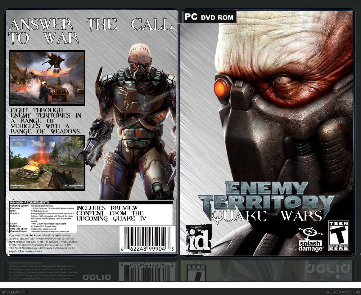
I would suggest you make all of your screenshots the same sized, and probably give them better borders. You should also get a better font and add a description. A better background would also be nice. Maybe another character on the back?
#11, that's still not very constructive. I mean, "I suggest changing the front into something more appealing and nice to look at" doesn't really help. You should give him an idea of what to do.
 Enemy Territory: Quake Wars Box Cover Comments
the reflection is just as bad as Version 1 of my Mario Meets Star Wars... The front is OK but the template where it says PC DVD ROM is off, and the back has absolutely no effort at all.
3.5/5 for the front
1/5 for the back
0.5/5 for the reflection
Overall: 2.7/5
[ Reply ]
its very plain but i like the renders used.. 3/5
[ Reply ]
soz i forgot about the reflection
[ Reply ]
could you please tell me what you think about it now
[ Reply ]
this is realy good 4/5
+fav
[ Reply ]
still what i thought before
[ Reply ]
the reflection is better now, good job on that. the Games for Windows is too stretched now, and the bottom of the back needs information
[ Reply ]
thanks il do that stuff by the way what do you think the rating is now
Edited at 1 decade ago
[ Reply ]
Its pretty ugly
[ Reply ]
#9, could you be more constructive? It's not that bad.
I would suggest you make all of your screenshots the same sized, and probably give them better borders. You should also get a better font and add a description. A better background would also be nice. Maybe another character on the back?
[ Reply ]
#10 The front is very ugly though! If i saw this box on a shelf in a game shop, it wouldnt attract me whatsoever!
Okay more constructive.....Hm.... I suggest changing the front into something more appealing and nice to look at :)
[ Reply ]
#11, that's still not very constructive. I mean, "I suggest changing the front into something more appealing and nice to look at" doesn't really help. You should give him an idea of what to do.
[ Reply ]
#12 Okay..... er..... An idea of what to do is put a paper bag over that strange mans head xD
[ Reply ]
how is it now
[ Reply ]
er ok but beter before
[ Reply ]
pretty damn good
[ Reply ]
#13, he's a Strogg, the main enemy race of the Quake series.
[ Reply ]
#13 havent u ever played quake!?!
[ Reply ]
Agreed with TTT. Could also make the front logo stand out more, but still nice. Keep it up.
[ Reply ]
The back looks mediocre and the ESRB and id Software logo need to swap spots. The front picture is kind of boring.
64 out of 100.
[ Reply ]