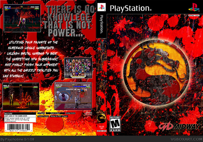
You over did the blood by about 10 times :P
Still pretty cool, but IMO the yellow doesn't go with the blood and black background. It's the all-too-overused color scheme of black-red-yellow. Just Black and red would probably be better
Have to agree with StH... over did it with the blood. The front is actually really nice IF you didn't have the lighter shade of red blood on it. Back... Too much blood on top of the layers, and I would remove all the scteenshots that aren't in full view. Don't mind the yellow/red colour scheme as it matches the logo and like lava.
What's with the legal text?.. it's like a SATIRE? Totally spoils it.
 Mortal Kombat Trilogy Box Cover Comments
Made it today. This one was fun. Maybe I over did the blood...
Edited at 1 decade ago
[ Reply ]
You over did the blood by about 10 times :P
Still pretty cool, but IMO the yellow doesn't go with the blood and black background. It's the all-too-overused color scheme of black-red-yellow. Just Black and red would probably be better
[ Reply ]
Have to agree with StH... over did it with the blood. The front is actually really nice IF you didn't have the lighter shade of red blood on it. Back... Too much blood on top of the layers, and I would remove all the scteenshots that aren't in full view. Don't mind the yellow/red colour scheme as it matches the logo and like lava.
What's with the legal text?.. it's like a SATIRE? Totally spoils it.
[ Reply ]
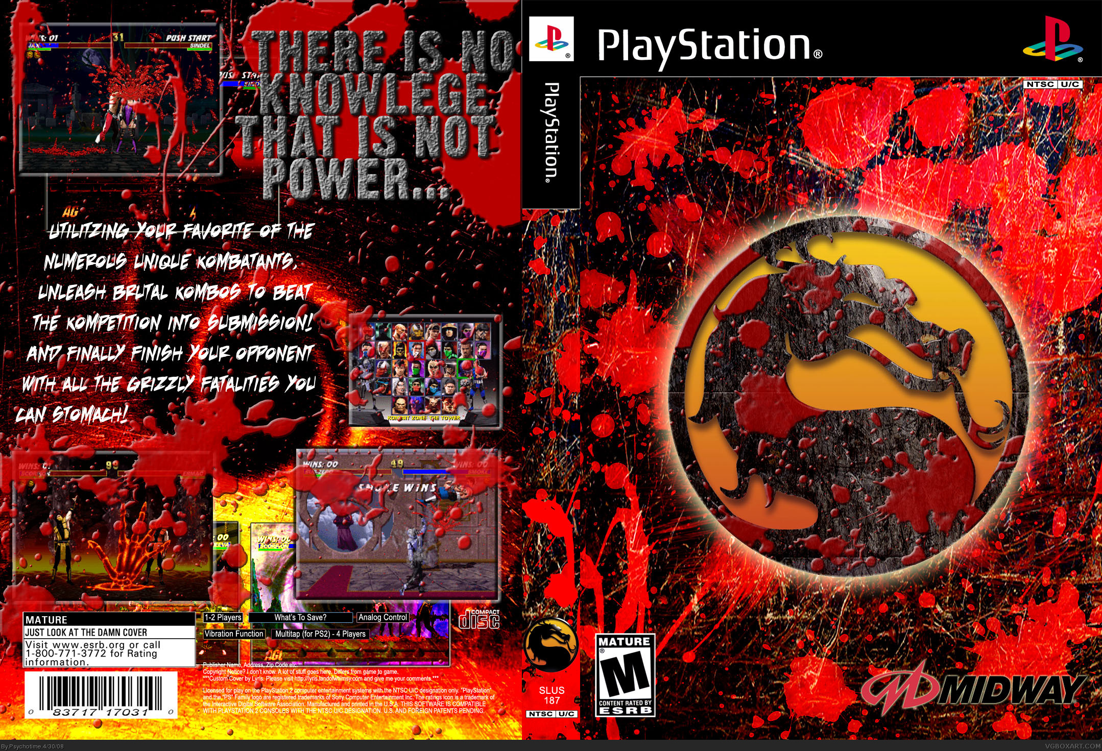
Tried to follow the Metal Slug Mummy's advice. Now it's on version 2.
#3, The legal text was just part of the template and I never cared enough to do anything to it. Removed now.
[ Reply ]