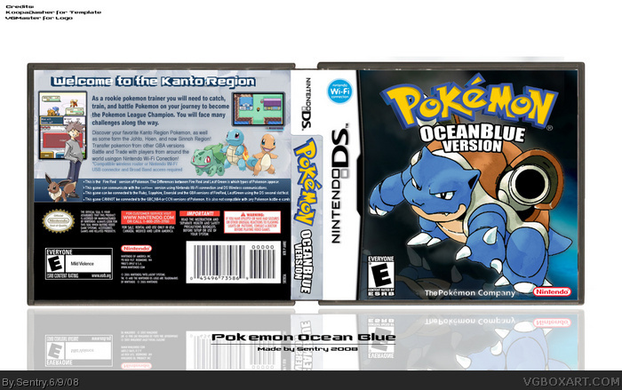
well I like the back, but the fronts a bit blurry and the Blastoise is small, also the esrbs are diffrent and the topline on the back is uncut. It looks nice although it lacks in the easy things.
Oh and for everyone complaing about the logo not being official, its a made up game title I came up with, lol.
you should credit me for the orignal idea of a game I made up but anyway.it looks a lot better now, but i still hate the top of the back font. but now it gets a fave.
The Gary pic you are using was the Offical Art in Pokemon Red and Blue I would suggest you replace it with Offical Art from Pokemon Leafgreen and Firered.
I've always liked this, even from the beginning, but now that I look back at it, I think it'd be a bit better if it were called AquaBlue Version instead.
 Pokemon Ocean Blue Version Box Cover Comments
New box
[ Reply ]
Sweet! :o
[ Reply ]
What he said^^
[ Reply ]
Pretty cool but I would of kept the logo official and you forgot the back ESRB. Good job, looks great.
Edited at 1 decade ago
[ Reply ]
Too bland IMO
[ Reply ]
#5, What can I do to make it more...not bland
[ Reply ]
#6 Get better backgrounds, or better yet, make your own. The grey is terribly borin, and it seems like the Pokemon on the front is a bit small.
[ Reply ]
the cover very bland
mabye a differnt backgrond, another render,
and i would have kept the logo official
[ Reply ]
The ESRB could be bigger
The Pokémon on the front could be bigger
The official Pokémon logo would look better
Overall though, looks nice, clean and sharp.
Great effort 3.5/5
[ Reply ]
well I like the back, but the fronts a bit blurry and the Blastoise is small, also the esrbs are diffrent and the topline on the back is uncut. It looks nice although it lacks in the easy things.
Oh and for everyone complaing about the logo not being official, its a made up game title I came up with, lol.
Edited at 1 decade ago
[ Reply ]
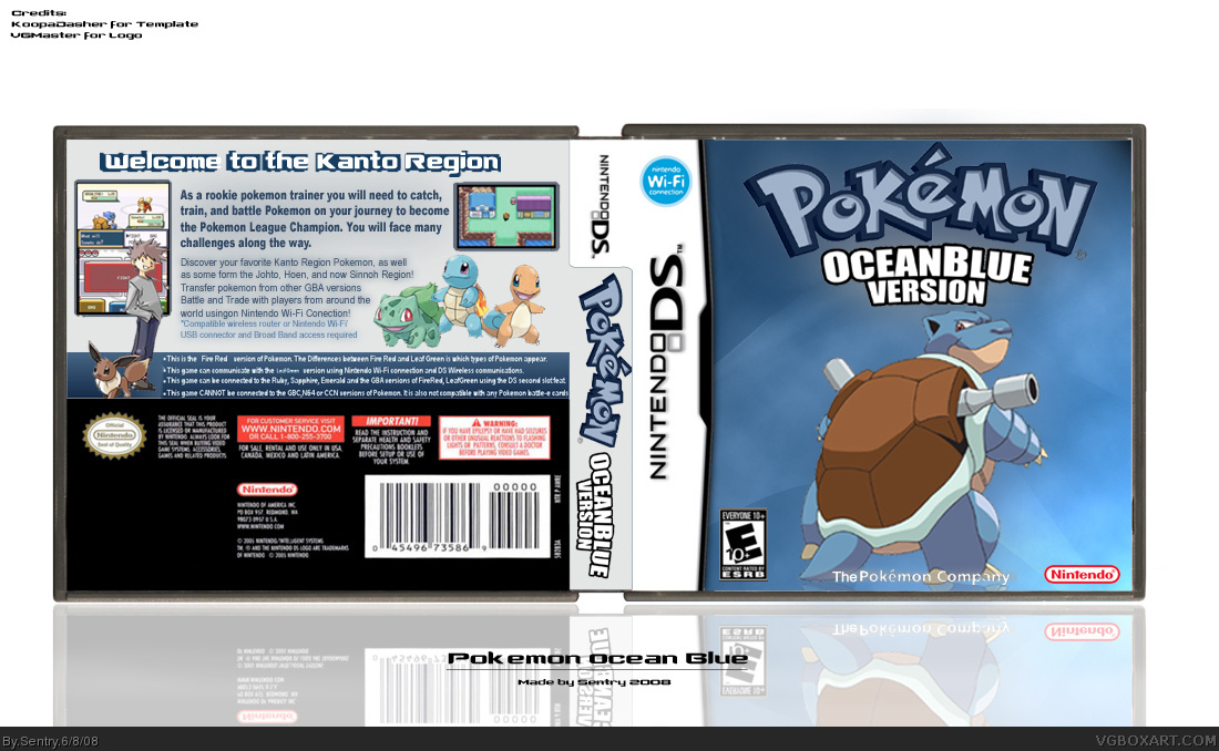
*Updated
Is it a little better now?
[ Reply ]
It's a lot better now.
[ Reply ]
you should credit me for the orignal idea of a game I made up but anyway.it looks a lot better now, but i still hate the top of the back font. but now it gets a fave.
Edited at 1 decade ago
[ Reply ]
Much better
[ Reply ]
I love teh update
[ Reply ]
The Gary pic you are using was the Offical Art in Pokemon Red and Blue I would suggest you replace it with Offical Art from Pokemon Leafgreen and Firered.
[ Reply ]
Edited at 1 decade ago
[ Reply ]
This is very well done, I especially like how you did the reflection of Blastoise on the front. Excellent work, looks official.
Presentation is also ace, mind if I ask what font you used for your sig? :)
[ Reply ]
#18, I used Clone Wars link
[ Reply ]
I've always liked this, even from the beginning, but now that I look back at it, I think it'd be a bit better if it were called AquaBlue Version instead.
[ Reply ]
LOL I spelled boring wrong.
What is I goina do? I is goina fave is what I is goina to.
Ignant.
[ Reply ]
That looks so real.
[ Reply ]
I WANT A HALL OF FAME!
Edited at 1 decade ago
[ Reply ]
This is really good, a lot of improvements compared to version 1!
[ Reply ]