This idea has been done many times before, and better. The characters are cut very choppy. The white around the renders look bad. No ESRB or developer logos. Would look better with a cartoon background rather than real life.
The outline as the style in my opinion is jsut an excuse for lazy cutting. And it looks like you stole that logo....and temp...and background, so give credit where credit is due.
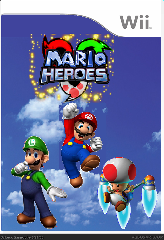
Ok,i seriously did it in Paint.
And I thought the background would look good.
Credit to Crayonman for the Template.
And Marker for the logo.But I kinda edited it.

 Mario Heroes Box Cover Comments
Once again, the outline is the style,kinda.
[ Reply ]
This idea has been done many times before, and better. The characters are cut very choppy. The white around the renders look bad. No ESRB or developer logos. Would look better with a cartoon background rather than real life.
Overall:
Idea: 2/5
Box: 2/5
Total: 4/10
[ Reply ]
The outline as the style in my opinion is jsut an excuse for lazy cutting. And it looks like you stole that logo....and temp...and background, so give credit where credit is due.
If you did this in paint: 4/5
If in anythign other than paint: 2/5
[ Reply ]
Ok,i seriously did it in Paint.
And I thought the background would look good.
Credit to Crayonman for the Template.
And Marker for the logo.But I kinda edited it.
[ Reply ]
#3, It was done once.
[ Reply ]
AWSOME!!!!!!!!!!!!!!!!!!!!!
[ Reply ]
#6 Sonic Kiddy. Instantly. Bad background, destroyed a beautiful logo, everyone is choppy and the "gold stars" look very random.
[ Reply ]
They are not random,they were ment to be there.
[ Reply ]
#4, i edited it T.T
give ACTUAL credit
[ Reply ]
sorry,Buddyboy edited it,.
my bad.
[ Reply ]
.... if your gonna copy an idea, i advise you make it "good"
[ Reply ]
#7, because he made a mario box?
XP lol
[ Reply ]
#12 lollolololo AHAAHAHAAH... no.
[ Reply ]
Choppy in some spots. 2/5
[ Reply ]