[ Box updated on July 24th, 2008 ] [ original ]
 Grand Theft Auto: New New York Box Cover Comments
Comment on super-mega-hyper-sonic's Grand Theft Auto: New New York Box Art / Cover.
[ Box updated on July 24th, 2008 ] [ original ]
Comment on super-mega-hyper-sonic's Grand Theft Auto: New New York Box Art / Cover.
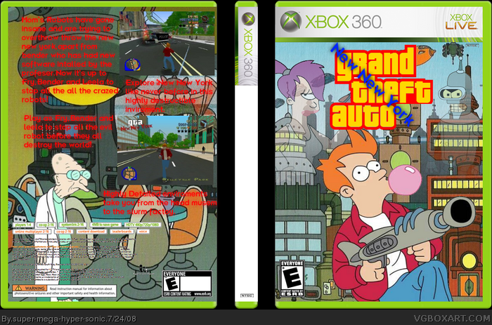
Renders from google and idea and screenshots and idea from link and sorry about the spine and not filling in the esrb. Logo edited my me.
Edited at 1 decade ago
[ Reply ]
Love the front, the back could be improved but still great idea, love it! 8/10 fav+
[ Reply ]
Love the front, the back could be improved but still great idea, love it! 8/10 fav+
[ Reply ]
oh, cock sorry for the double comment...
[ Reply ]
Why add a spine if you didnt fill it in...
[ Reply ]
#5, part of the temp
[ Reply ]
#6 go on www.dafont.com i believe they have the futurama font, use that for new new york and dont fade the charachters as much, also use less information on the back and make it stand out more, (a glow maybe?)
#8, i mean the one from the logo, ps could you pm me the temp but with no esrb logos or nstc logos, as i only use bbfc/pegi and pal
Edited at 1 decade ago
[ Reply ]
#7, that is a futurama font mamed Futurama Bold Font.
[ Reply ]
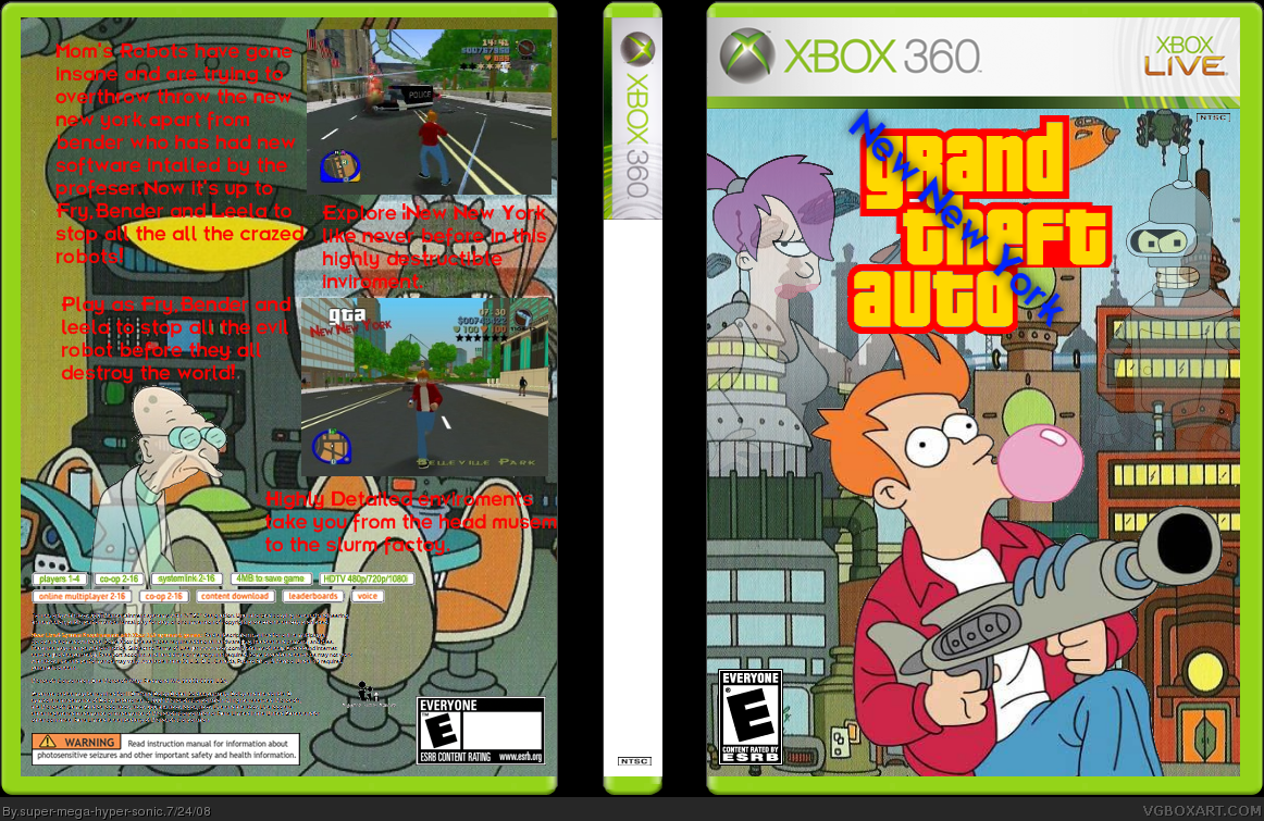
Update! Unfaded farnsworth and made the text glow a bit.
[ Reply ]
hahaha i love this idea, this is awesome!
5/5
+fav
[ Reply ]
nice one
[ Reply ]
#6, Are you an idiot? If theirs a freaking spine then fill it in or delete it! Good lord why would you keep the spine if you didnt even fill it in?!
[ Reply ]
this was a great idea ilike the front the back a little its still good
[ Reply ]